(Note: Keep in mind, even though I'm going to be explaining the process, this isn't so much a tutorial as it is a look into how I think when I use Photoshop. For example, I'm not going to tell you what a "layer" is, so if you don't know...well, I guess I probably should tell you. In Photoshop, everything is in layers which go on top of a [usually blank] background. Having separate layers allows you to add and delete pieces to the picture without the fear of making serious mistakes, such as completely painting over some guy's face. You can also use them for positioning [i.e. what goes in front, what goes behind, etc.]. There, you happy now?)
Yes? Good! On we go!
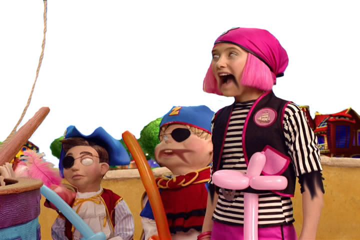
So, here's the original picture (just so you know, you can click on any of these pictures to see them at full size, where you can appreciate the changes the most):
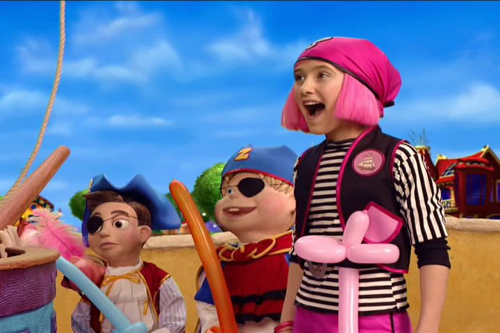 ...Yeah, don't ask me. I didn't choose it. It's apparently from some Nickelodeon show, and since I abstain from all non-nightly Nickelodeon, I haven't seen it. However, this is the picture they told us to Photoshop, and so I figured I might as well give it a shot. I love a challenge.
Step 1: Think of an idea.
This was actually the hardest of all the steps, by far. I wanted to do something original and clever, while still keeping in spirit with the original picture. Because one of the characters in this picture is a young girl, some people tried to Photoshop this into a Chris Hansen special. That's a territory I seriously wanted to stay away from, because it's (a) unoriginal and (b) not the kind of thing I do.
So, I was wracking my brain for a long time (in truth, it was about 10 minutes, but it seemed like a long time) trying to figure out my angle. Then, out of the aether from which most ideas emerge, I had a thought. What about some sort of undead-like angle? No one had really tried that before, and I could play a bit on the Pirates of the Carribean popularity.
But zombies, while funny in and of themselves on the internet, needed to be done well if I wanted any recognition for this contest. So, I set off to work.
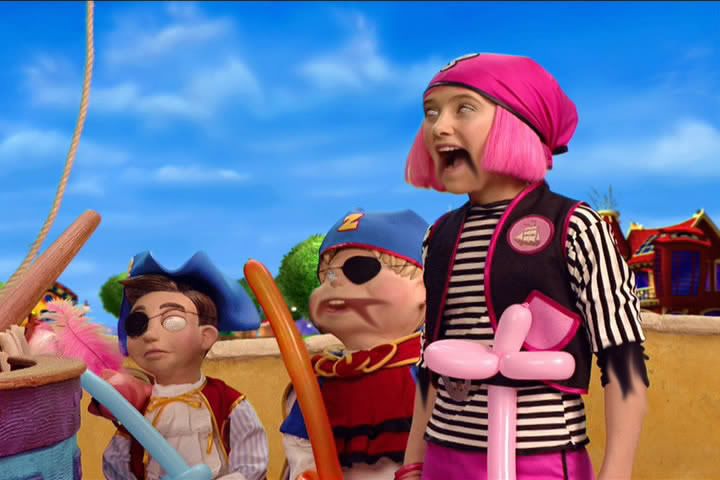
Step 2: Create basic zombie looks.
This is the most fundamental step, I think, but turned out to be very simple. There were only two tools I used for this:
1. The "Clone Stamp" tool, which basically replicates a particular area wherever you want. I used this to make the pupil-less "blanked eye" look which I think works well for the undead. As it turns out, this is one of my favorite Photoshop tricks, as some of my other pictures will attest to.
2. The "Smudge" tool, which basically functions like you'd think it did: by smudging/smearing a piece of the picture. I used this to manipulate the two smiling characters' mouths, making it look like their faces are cut/rotting. I also used it to a lesser extend with the girl's sleeve, giving it a somewhat torn look.
And here's the result:
 Step 3: Eliminate the background.
That light-blue sky with whispy clouds; that's doing nothing for me. And unless I'm trying to be ironic (which I'm not), it's not going to work juxtaposing it with such a horrific foreground. So, let's take it out, shall we? This was a simple job for the "eraser" tool.
Step 4: Add new and improved background.
What innocent part of nature is practically synonymous with evil? Lightning, of course! (Which is in truth quite unfair to lightning; c'mon, people, it's just a large buildup of static electricity. You think it's funny and cute when a balloon makes your hair stand, but when it's in large quantities, it's suddenly the embodiement of all things unholy. Sheesh. But I digress.) So, I did a Google search for lightning, copied the first picture I found, resized it a bit, and pasted it behind the foreground layer.
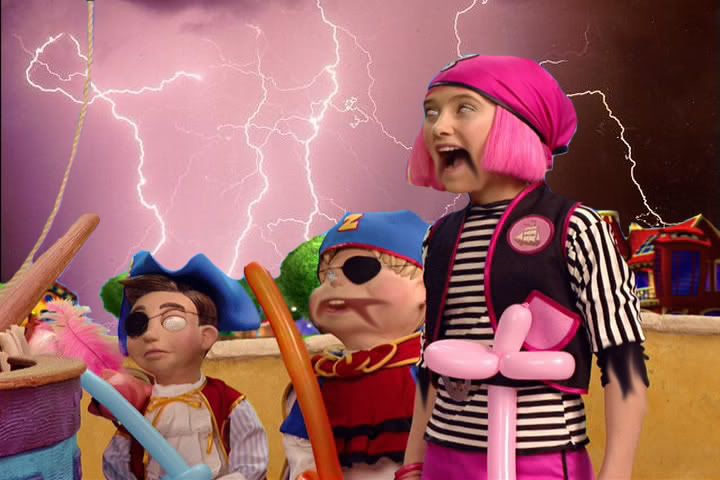 I particularly like the lightning that appears to be striking the house on the right (with the little flourish and everything). That was completely unintentional, but awesome nonetheless.
Step 5: Give them undead coloring.
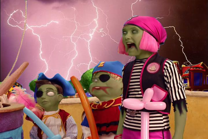
Of course, something's been missing. Even though they have the look and background of the walking dead, our heroes have very human coloring. That surely won't do. Let's give them a couple weeks of death more to produce that lovely gangrene look. We do this by creating a new layer (I actually made a new layer for each character, but that's just semantics) and painting over all skin layers with a dark green color. You then change the transparency of this layer so it's no longer opaque. I made my transparency 35%, and ended up with the following.

Step 6: Give sleepy-eyes.
This is very minor (in fact, you probably have to look at both pictures large to see the change), but in my opinion, essential. In order to really clinch the whole zombie look, it is essential to have dark rings around the eyes to give them that sunk-back look. It really makes the difference betwixt "zombie" and "person who fell into a bunch of green dye." It's basically the same deal as the skin; just a new layer with some transparent black paint around the eyes.
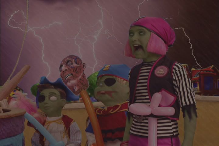
Step 7: Add a prop for extra potency.
There's a lot of things I could have done for this one. I could have added actual swords, ships masts, ghosts, what have you. However, I thought to myself, "They pirates, and they're zombies. What do they have in common?" Suddenly, it came to me: cutting off people's heads (or, in a zombie's case, ripping it off). So I did a search for heads (and only heads). This was actually a very difficult search, because I'd either get anatomical drawings, random head-shots, or pictures so grotesque that I wouldn't even think to use them.
Eventually, though, I found a party-store site with a fake "skinned head" that I thought meshed well with the zombie theme. The balloon swords in the picture were going to a terrible waste, so I thought I should take advantage of one by impaling the head on it.

Let's stop here for a second. This was my original vision when I started the process, and I had now reached it. I could submit the piece now. However, when looking at it, I wasn't satisfied. There was something...not quite right about the picture. After a little bit of thinking, I realized the problem. It's too bright! The foreground is still too bright and chipper to really get the point across. It had to be darkened to achieve its full potential. And so, I decided to go ahead and keep editing it.
And now, let's continue where we left of.
Step 8: Darken it up/add rain for atmosphere.
At first I just added a new layer, filled it all with black paint, and lowered the transparency. This worked alright, but it just darkened the picture without really adding anything. So, I tried a little trick to make it appear as though it were raining. Here's how it goes:
-Fill in the layer with a dark gray (pure black doesn't work).
-Use the "Smudge Stick" filter with the settings set to their maximums. This gives the layer diagonal streaks.
-Lower the transparency. This gives the look of a raging storm (particularly with the lightning in the background), and you're left with the following:
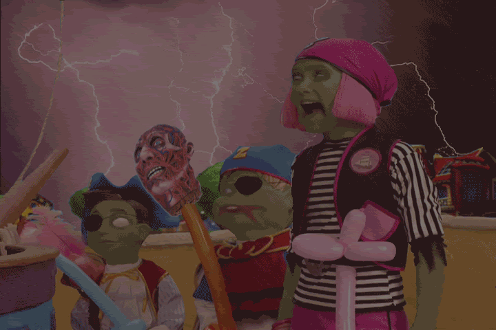
Step 9: Make it actually rain.
Once again, I wasn't satisfied with how my final product turned out. It was too...too...motionless. I needed a dynamic element. So, I decided to turn this baby from a JPEG into an animated GIF. I did this by increasing the size of the "rain" layer (which actually made it look slightly more realistic) and, using Adobe ImageReady, made 5 frames of animation, in each of which I moved the rain slightly. The result is the following.
 Amazing what a little motion will do, eh?
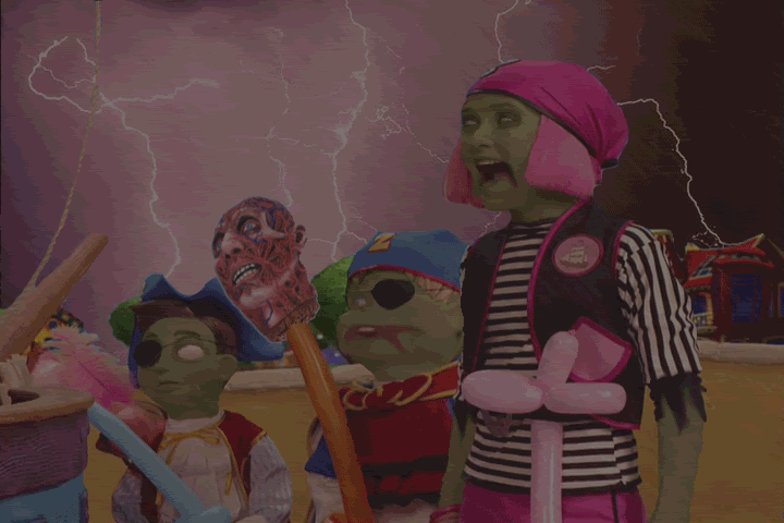
Step 10: Add lightning.
Rain is all fine and good, but if you really want to give the appearance of a storm, what better way than with our
Step 11: Add sound and finish it up!
One of the interesting things about the site on which the contest was is the fact that you are allowed/required to add sound. This can really make or break your entry. Luckily, I caught a break. I had previously created a music loop using the song "The Kraken" from Hans Zimmer's Pirates of the Carribean 2 soundtrack. Actually, I only used a small piece from the end of the song, as it loops almost flawlessly. However, up until this point, I have not found a use for that clip. I thought this would be the perfect picture to match it with.
And so, with all that put together, I submitted my entry for the Photoshop contest, in what I entitled "They've Caught the Curse!!!" As they say, "Tada!"
Well, I hope you've enjoyed this look at my Photoshopping. I also hope that you've learned how managable it can be; what may appear to be a complex edit is really just a series of simple edits, with the idea being the hardest part. My entry turned out to be the highest-rated (and most consistently highly-rated) in the contest, as well as the most-viewed. I'd definitely consider that a success under any circumstance, even though it didn't win. And I hope you all at least try some photo-editing one of these days, be it with Photoshop or some other program (and don't worry if you don't have much experience; everything I know, I learned by experimentation and a Google search here and there). It's a challenge, it's fun, and you might just find that you have a knack for it.
Happy 'shopping!
4 comments:
photo shop?
shopping for photos?
anyone can do photoshop and make it look special. you just have to pick two concepts and put them together. like Captain America in Iraq after a mission.
it won't let me put it put here but rest assure that it'll be on your myspace soon enough.
anyone can do photoshop and make it look special.
Yes, that's my point exactly!
You have advanced much since you made Orozco talk in Spanish II back in SA.
-Comrade Chavez
¡VIVA LA FEDERACIóN!
yeah it's a gay point. like you are!
>:D
you said it. not me. YOU!
Post a Comment