
Showing posts with label Photoshop. Show all posts
Showing posts with label Photoshop. Show all posts
Friday, October 31, 2008

Sunday, June 22, 2008
Just to Prove I'm Still Alive
Not one Photoshop, but two (both utilizing the awesome power of Diffuse Glow)!
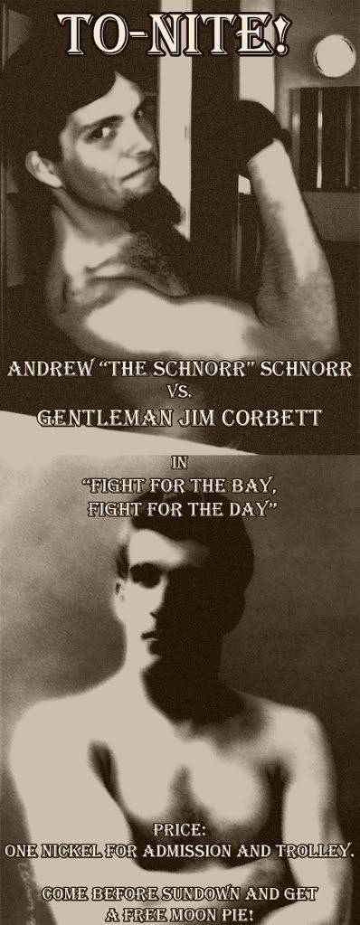
This next one I'm actually using as my current desktop.
Actual content coming, I swear.
This next one I'm actually using as my current desktop.
Actual content coming, I swear.
Friday, April 25, 2008
You Know The Internet Has Corrupted You...
When you can see this...
...and turn it into THIS!!!
(Note: No, I didn't just make that today; I've had it for a while. Had I the time to actually make something like that, I would use it to write a real post instead of just filler. Hi-larious filler, but filler nonetheless.)
...and turn it into THIS!!!
(Note: No, I didn't just make that today; I've had it for a while. Had I the time to actually make something like that, I would use it to write a real post instead of just filler. Hi-larious filler, but filler nonetheless.)
Thursday, April 10, 2008
Quick Thoughts on Covers
You know, I was just thinking back to my book.
Namely, I wonder what it would have looked like had I access to a fully-fledged Photoshop program, as opposed to the absolutely primitive Adobe PhotoDeluxe 98 or whatever we had at the time.
One thing I know for sure would have changed would have been the font. The font that's used on my book's cover isn't what I wanted, or what I asked to be used. I guess when typesetting the thing, they weren't able to download the font I asked for, and so they stuck me with some not-exactly-Times-New-Roman font. Granted, it was italicized, but it was still much more plain than the font I had asked them to use (and I don't remember what that font was, so don't ask).
I also think that I might have messed with the picture a bit. If I were to remake it now, I think I would take the picture and make it starker yet more minimalist. It would be abstract, as opposed to showing you exactly what it was showing you; it would make you think.
'Course, I really have no idea if I this is because I have access to greater photo-editing software or because I've changed my own style in the...God, three to four years since I've worked to get the book published. I know I've matured, perhaps gotten a little darker and grittier (or, at other times, more wacky and light-hearted), so perhaps I'm trying to superimpose my current personality onto my older (er, younger) one.
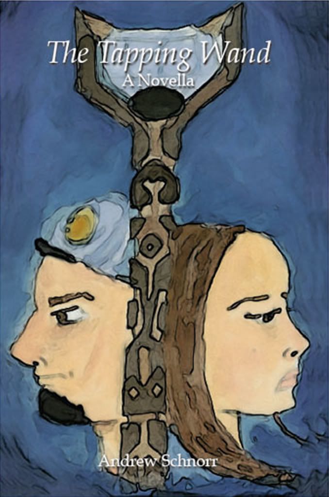
Anyway, to give you an idea of what I mean, I decided to give the cover a little push through Photoshop. Here's how the cover looks to the purchasing public:
 And here's what the cover would look like if I had published the book today:
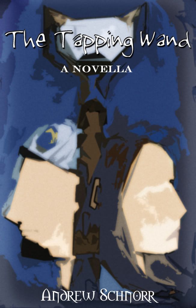 Is it better? Well, I can't really give an unbiased answer. All I know is that I would be more likely to pick up the latter cover at a bookstore...much more likely. Who knows, maybe in another 5 years, I'll be totally turned around on the subject, or maybe I'll think there should be yet another version.
But anyway, it was just a passing thought...
Namely, I wonder what it would have looked like had I access to a fully-fledged Photoshop program, as opposed to the absolutely primitive Adobe PhotoDeluxe 98 or whatever we had at the time.
One thing I know for sure would have changed would have been the font. The font that's used on my book's cover isn't what I wanted, or what I asked to be used. I guess when typesetting the thing, they weren't able to download the font I asked for, and so they stuck me with some not-exactly-Times-New-Roman font. Granted, it was italicized, but it was still much more plain than the font I had asked them to use (and I don't remember what that font was, so don't ask).
I also think that I might have messed with the picture a bit. If I were to remake it now, I think I would take the picture and make it starker yet more minimalist. It would be abstract, as opposed to showing you exactly what it was showing you; it would make you think.
'Course, I really have no idea if I this is because I have access to greater photo-editing software or because I've changed my own style in the...God, three to four years since I've worked to get the book published. I know I've matured, perhaps gotten a little darker and grittier (or, at other times, more wacky and light-hearted), so perhaps I'm trying to superimpose my current personality onto my older (er, younger) one.
Anyway, to give you an idea of what I mean, I decided to give the cover a little push through Photoshop. Here's how the cover looks to the purchasing public:
And here's what the cover would look like if I had published the book today:Is it better? Well, I can't really give an unbiased answer. All I know is that I would be more likely to pick up the latter cover at a bookstore...much more likely. Who knows, maybe in another 5 years, I'll be totally turned around on the subject, or maybe I'll think there should be yet another version.But anyway, it was just a passing thought...
Thursday, March 20, 2008
Complete and Utter Vanity (Apologies to Your Browser Speed)
I like to think that my computer, and all my documents are pretty organized. For example, for pictures that were taken this school year in Berkeley, I have a folder within "My Pictures" called "Berkeley Year Three." In this folder, I have a folder for every month of the year (and a few for things that transcend beyond one month or are considered "exceptional").
The "March 2008" folder has a lot of pictures in it. A LOT.
I'm not sure why. I think it may be a combination of a bit of (relative) free time and...okay, I don't know what the other part of the combination could be. I've just been inspired to take a lot of picture. Of course, about 98% of them are of me (+/- 2%). There's not much else to photograph when you're alone in your room. But I like to think that I can be interesting enough for more than one picture.
Also, I like to Photoshop pictures of myself.
So, I decided to show off some of these pictures (a small fraction of them, but still what I would consider a good representation), as well as some of the Photoshop products.
So, let's get started! (Oh, and if your computer crashed trying to load this page, get a better computer! It's nowhere near as bad as during the Comic-Con days.)
We'll start out with one of the rarest pictures you'll ever see. I've only taken one picture of me like this, and I don't plan on doing so again. This is a side of me that most people never see. However, it was late at night, and I decided that perhaps, maybe, I should take a single picture of myself...wearing glasses.
...
......
...
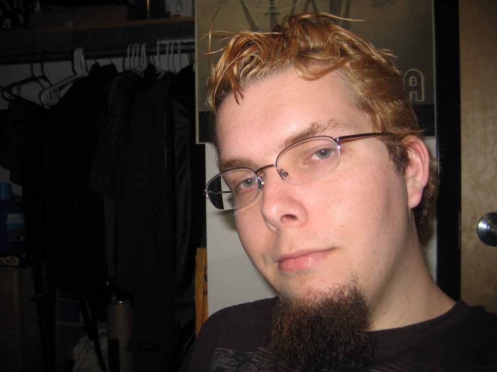 There, I hope you enjoyed my restricted-vision self. That may be the only time you see me wearing glasses in a picture.
And next, we had a bunch of shots I decided to take one night. On said night, I noticed that a few locks of my hair were down, so I decided to do some "pretty boy" shots; maybe send them in to be a part of a gang, get myself a nickname like "Two-Bit" or "Soda-Pop". Or "Pretty-Boy." It's all good.
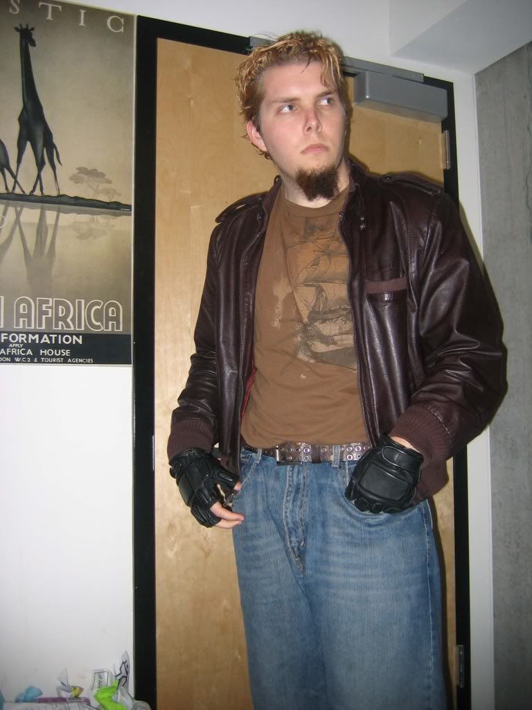 As I said, this is but a small fraction of the pictures taken, but I can assure that in most of them, I am not looking toward the camera. It seems to be a lot more mysterious. You can just imagine that when someone's not looking at the camera, they're saying something like "Yeah, whatever," or the ever-popular "..."
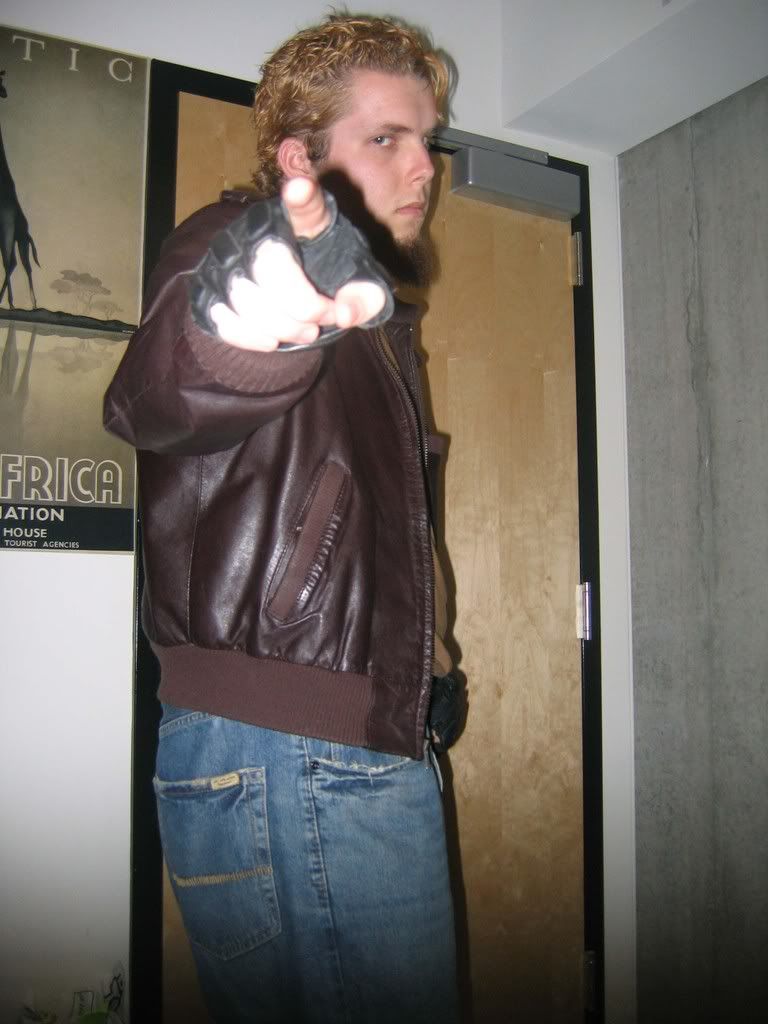 I've always been a fan or pointing toward the camera. I find the resulting pictures seem a little more...interactive than most.
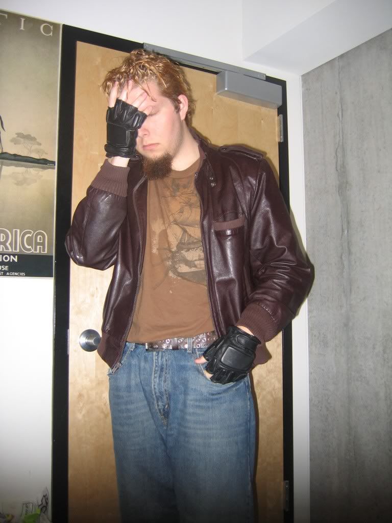 This can either be a picture portraying someone's emotional downfall, or some guy saying, "Oh, God, what did I eat last night?"
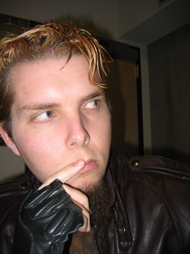 I also decided to do a few close-up shots. You'll notice I'm still not looking at the camera.
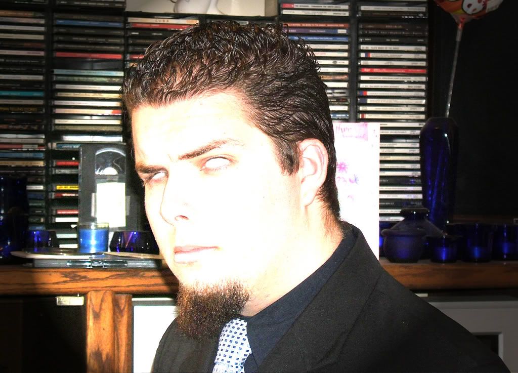
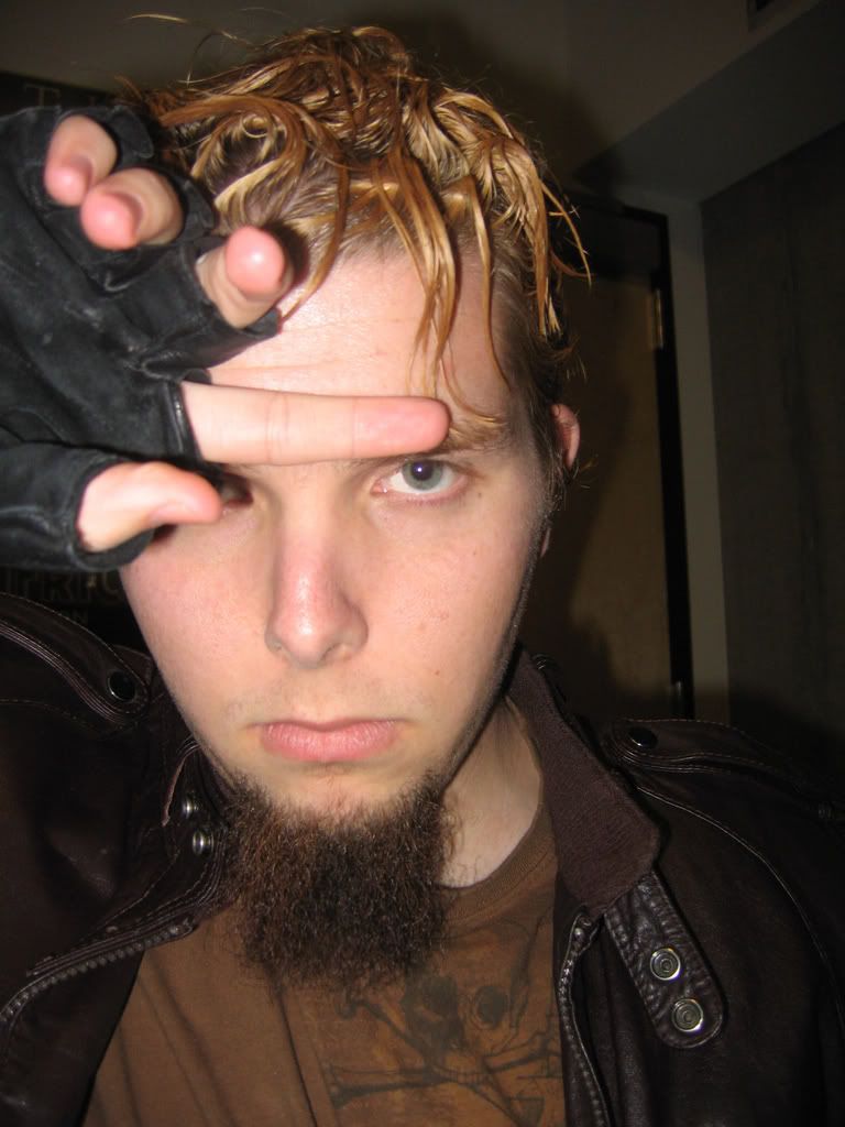 This one was actually a semi-accidental shot, believe it or not. My camera was set up on a timer, and right before this one took, I was scratching my eyebrow area. And yet, to anyone who sees it, it appears to be some sort of emotive portrait picture.
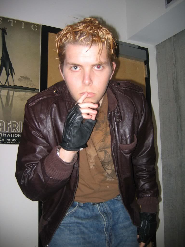 Due to my larger-than-average pupil size, I tend to have more red-eye issues than your normal workaday average Joe. So often, I'll have to use Photoshop just to make myself look a smidgen less demon-like. But for some reason, I thought this picture worked pretty well as having one red eye and one black one. Almost gives a Terminator feel to the whole thing.
Speaking of Photoshop, let's take a look at what I did with a couple of pictures.
 So, here's the original picture. Personally, I feel it would have looked better had I my thumbs in my pockets, but you only have a split two seconds to figure out what you're going to do before the camera flashes. In any event, I thought it would work we..
 One thing I like to do on Photoshop is to remove the somewhat mundane background of my bedroom and replace it with something a bit more exciting. More often than not, I'll choose a city at night. I don't know, something about it just screams "interesting." However, to do this, you need to make sure that the lighting isn't as intense on yourself. Otherwise, it just looks awkward.
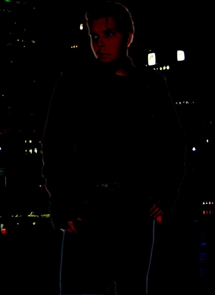 While I really like the way this looks it was, truth be told, accidental. (Like I've said before, the best way to learn on Photoshop is just to experiment.) This was done by applying the "Satin" blending option to the layer with my picture on it, and having the Mode be "Linear Burn". Somehow it turned into this, and I really liked it.
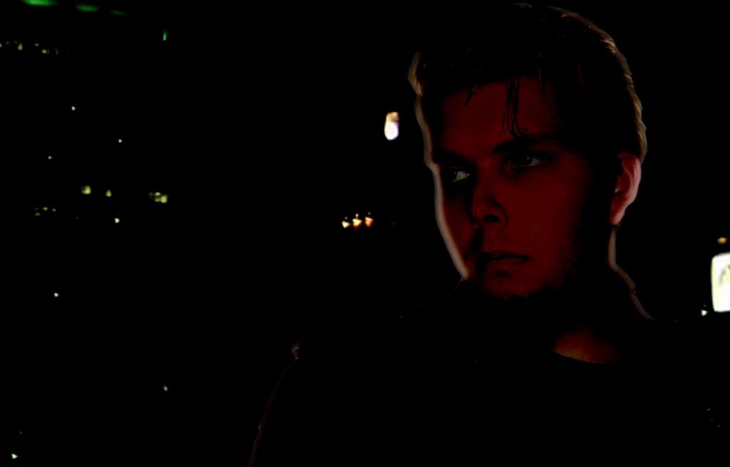 In fact, I liked it so much that this is now my desktop background. (Obviously, at a higher resolution.) It's a pretty kickass desktop, if I do say so myself.
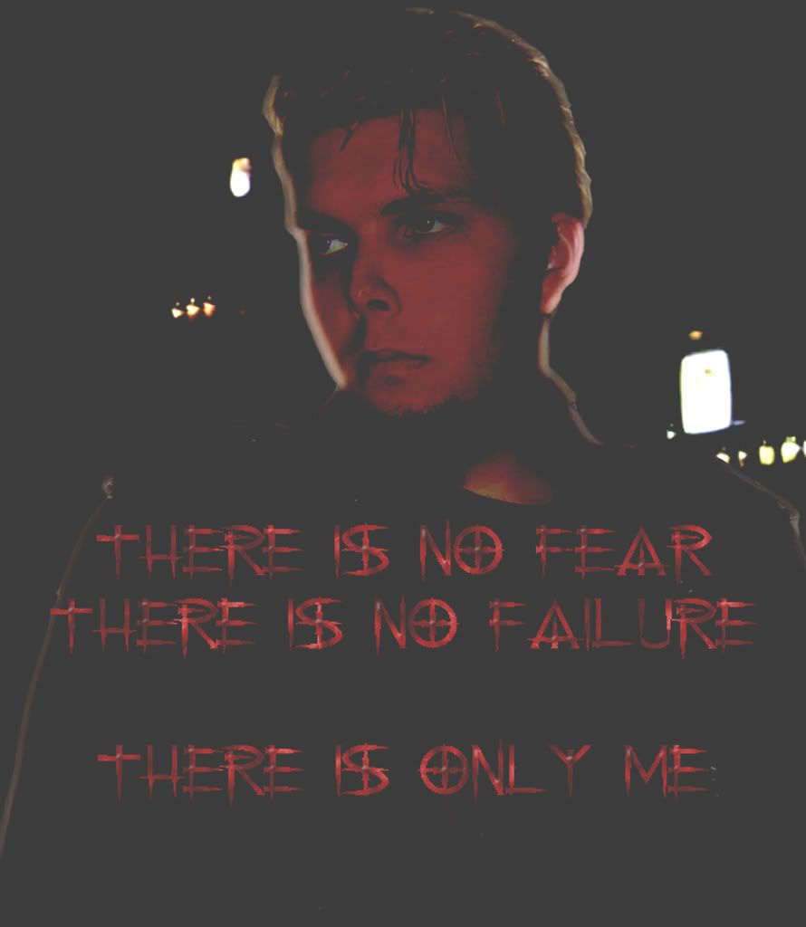 Also, one of the things I tend to to do is add some random lines to pictures, to give it even more atmosphere. This is the "quote" for this picture. Also, you may notice this is quite brighter than the previous two. That's because it was meant to be put on my MySpace/Facebook accounts, and unless you brightened it a bit, it just looked like a black box. As is, I think it looks like it could be the poster for some Jet Li movie (in which Jet Li doesn't appear).
So, here's the second Photoshop project on here. For a while now, I've wanted to have a picture in which I'm holding fire or a fireball. My early (as in, 2005) attempts at creating fire on Photoshop were...well, lame. However, the resources of the Internet are boundless, and I was able to find someone who offers a tutorial on creating fire, as well as a few brushes to help you out. To give proper credit, here is their website. While some may consider using a special brush to be cheating, I don't. After all, Photoshop is meant to make things easier. Plus, in order to make really realistic-looking fire, there's quite a few additional steps, and there are options for customizations all along the way. So, let's take a look.
 Here's the original picture. Note that I didn't remove my red-eye. I figured that if I'm going to be holding fire, it would actually be more appropriate to keep it. There are a few different "holding" poses I had, but I thought this one was the best, if only for the intensity of my face.
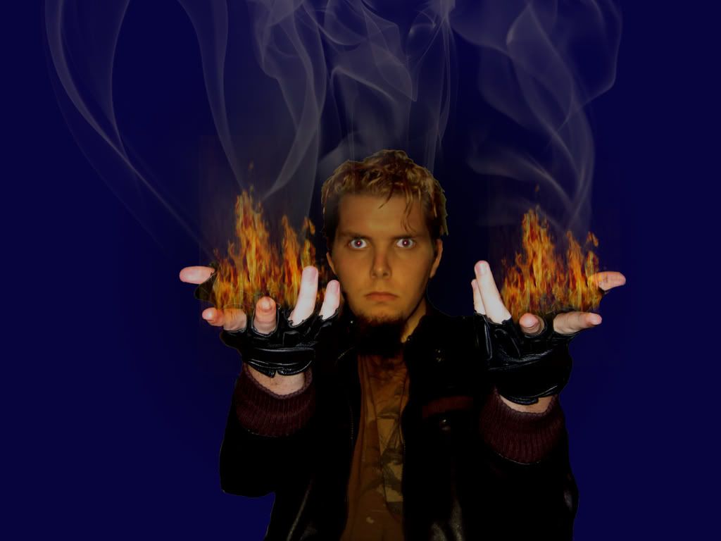 And here's what it looks like after the edits. Note a few things I did. First, I put a little bit of an orange glow to the face, to demonstrate a new lighting source (it's not perfect, but I think it works). I also cut out my upwards-pointing fingers and repasted them over the flames to make it less obvious that the fire was just pasted on the hands. I won't show you a comparison, but trust me, it make the illusion work out a lot better. Also, I'm not entirely happy with the rising smoke. Had I the chance to do that part over, I think I'd add some difference clouds to it.
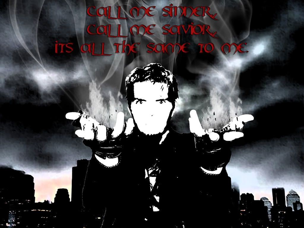
And of course, after doing this, I decided to put on some Photoshop filters. Why? Because I'm a filter whore, that's why. It's one of my weaknesses, I suppose; a temptation I can't resist. What's interesting is that each filter will completely change the feeling of a picture. I've included four different pictures and you'll notice that each one has a different "quote" that I think fits with the feel of the piece.
Oh, and each of the pictures are in front of a dark city. Because I'm predictable.
 With this one, I thought the eyes really stood out, and that the expression was a bit pout-ier than normal. To me, this kind of looked like some sort of lost soul. So I went with that.
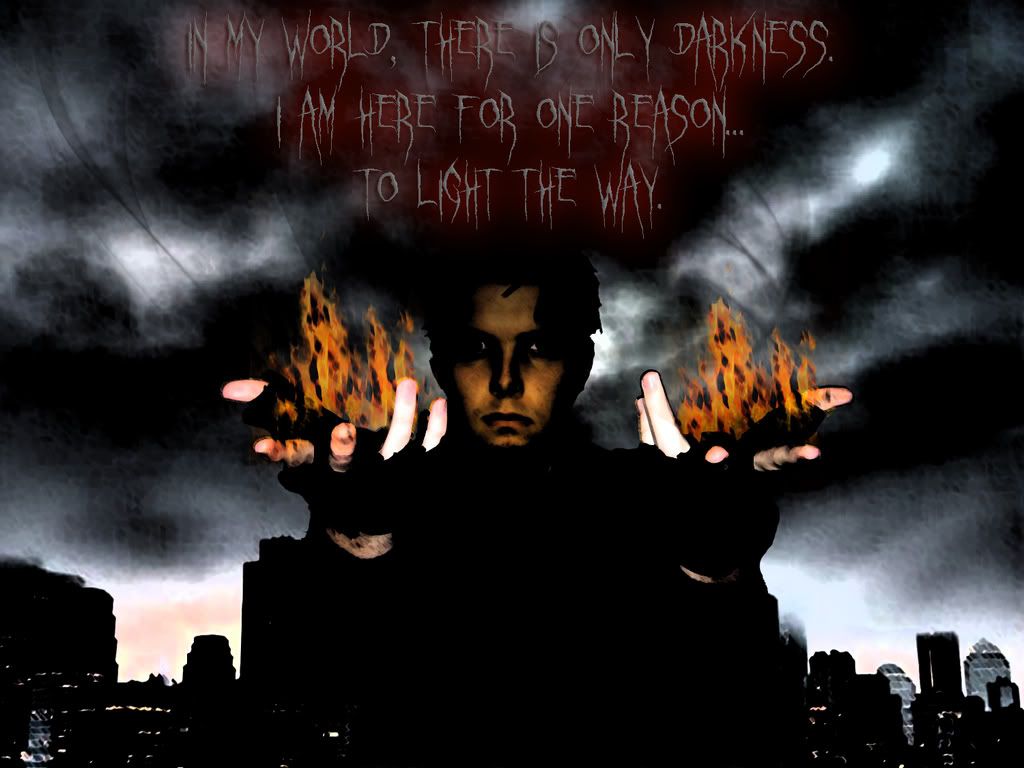 Interestingly, this is the only one of my filtered pictures that's in color, possibly because most of the colored filters just make the picture look messy. This one, however, I felt really added to it. Of all the ones, I think the expression is the most neutral, and yet still quite mysterious and deep. One of those "hero or villain" ambiguities. I would say that this one is my favorite. (I also was tickled by my own double-entendre use of "light".)
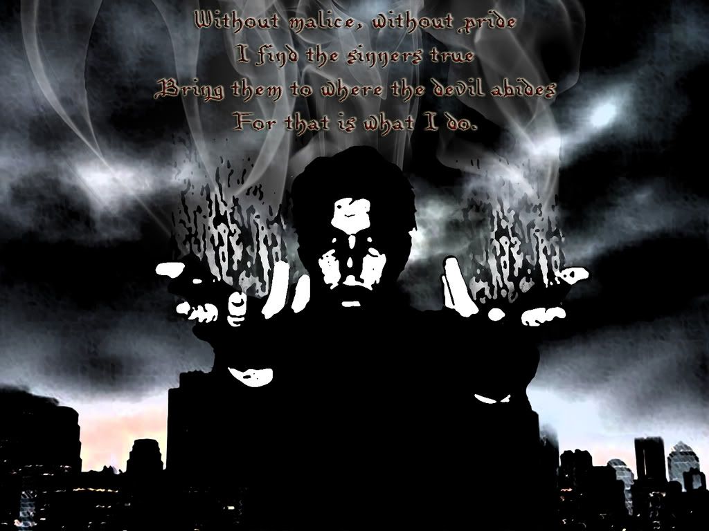 This one came out looking like some sort of new-age demon. The fire doesn't even look like fire; it looks like some sort of unholy darkness. Anyway, I apologize for the somewhat weak rhyme, but remember, I'm making this up as I go along.
 This one looks like it could be some devil-may-care protagonist who follows his own rules. I always find that when I use this filter ("Torn Edges", if you're curious), my pupils always stand out like a freight train.
So that's my Photoshop work. I only wish I wasn't so interested in it that it keeps me up at night, brushing and clicking away. Oh, well, at least something comes out of it.
And, now, I'll end with another picture of my hair sticking up. Because it's fun seeing how tall my hair can get!
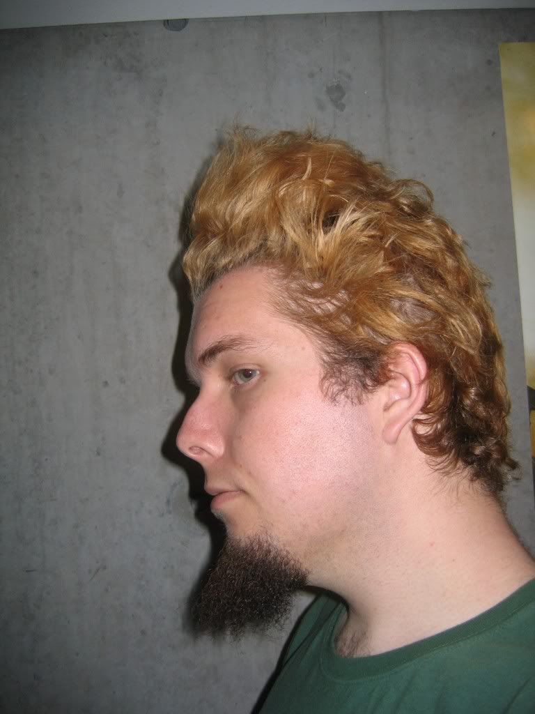 ...Okay, I'm done.
The "March 2008" folder has a lot of pictures in it. A LOT.
I'm not sure why. I think it may be a combination of a bit of (relative) free time and...okay, I don't know what the other part of the combination could be. I've just been inspired to take a lot of picture. Of course, about 98% of them are of me (+/- 2%). There's not much else to photograph when you're alone in your room. But I like to think that I can be interesting enough for more than one picture.
Also, I like to Photoshop pictures of myself.
So, I decided to show off some of these pictures (a small fraction of them, but still what I would consider a good representation), as well as some of the Photoshop products.
So, let's get started! (Oh, and if your computer crashed trying to load this page, get a better computer! It's nowhere near as bad as during the Comic-Con days.)
We'll start out with one of the rarest pictures you'll ever see. I've only taken one picture of me like this, and I don't plan on doing so again. This is a side of me that most people never see. However, it was late at night, and I decided that perhaps, maybe, I should take a single picture of myself...wearing glasses.
...
......
...
There, I hope you enjoyed my restricted-vision self. That may be the only time you see me wearing glasses in a picture.And next, we had a bunch of shots I decided to take one night. On said night, I noticed that a few locks of my hair were down, so I decided to do some "pretty boy" shots; maybe send them in to be a part of a gang, get myself a nickname like "Two-Bit" or "Soda-Pop". Or "Pretty-Boy." It's all good.
As I said, this is but a small fraction of the pictures taken, but I can assure that in most of them, I am not looking toward the camera. It seems to be a lot more mysterious. You can just imagine that when someone's not looking at the camera, they're saying something like "Yeah, whatever," or the ever-popular "..."I've always been a fan or pointing toward the camera. I find the resulting pictures seem a little more...interactive than most.This can either be a picture portraying someone's emotional downfall, or some guy saying, "Oh, God, what did I eat last night?"I also decided to do a few close-up shots. You'll notice I'm still not looking at the camera.This one was actually a semi-accidental shot, believe it or not. My camera was set up on a timer, and right before this one took, I was scratching my eyebrow area. And yet, to anyone who sees it, it appears to be some sort of emotive portrait picture.Due to my larger-than-average pupil size, I tend to have more red-eye issues than your normal workaday average Joe. So often, I'll have to use Photoshop just to make myself look a smidgen less demon-like. But for some reason, I thought this picture worked pretty well as having one red eye and one black one. Almost gives a Terminator feel to the whole thing.Speaking of Photoshop, let's take a look at what I did with a couple of pictures.
So, here's the original picture. Personally, I feel it would have looked better had I my thumbs in my pockets, but you only have a split two seconds to figure out what you're going to do before the camera flashes. In any event, I thought it would work we..One thing I like to do on Photoshop is to remove the somewhat mundane background of my bedroom and replace it with something a bit more exciting. More often than not, I'll choose a city at night. I don't know, something about it just screams "interesting." However, to do this, you need to make sure that the lighting isn't as intense on yourself. Otherwise, it just looks awkward.While I really like the way this looks it was, truth be told, accidental. (Like I've said before, the best way to learn on Photoshop is just to experiment.) This was done by applying the "Satin" blending option to the layer with my picture on it, and having the Mode be "Linear Burn". Somehow it turned into this, and I really liked it.In fact, I liked it so much that this is now my desktop background. (Obviously, at a higher resolution.) It's a pretty kickass desktop, if I do say so myself.Also, one of the things I tend to to do is add some random lines to pictures, to give it even more atmosphere. This is the "quote" for this picture. Also, you may notice this is quite brighter than the previous two. That's because it was meant to be put on my MySpace/Facebook accounts, and unless you brightened it a bit, it just looked like a black box. As is, I think it looks like it could be the poster for some Jet Li movie (in which Jet Li doesn't appear).So, here's the second Photoshop project on here. For a while now, I've wanted to have a picture in which I'm holding fire or a fireball. My early (as in, 2005) attempts at creating fire on Photoshop were...well, lame. However, the resources of the Internet are boundless, and I was able to find someone who offers a tutorial on creating fire, as well as a few brushes to help you out. To give proper credit, here is their website. While some may consider using a special brush to be cheating, I don't. After all, Photoshop is meant to make things easier. Plus, in order to make really realistic-looking fire, there's quite a few additional steps, and there are options for customizations all along the way. So, let's take a look.
Here's the original picture. Note that I didn't remove my red-eye. I figured that if I'm going to be holding fire, it would actually be more appropriate to keep it. There are a few different "holding" poses I had, but I thought this one was the best, if only for the intensity of my face.And here's what it looks like after the edits. Note a few things I did. First, I put a little bit of an orange glow to the face, to demonstrate a new lighting source (it's not perfect, but I think it works). I also cut out my upwards-pointing fingers and repasted them over the flames to make it less obvious that the fire was just pasted on the hands. I won't show you a comparison, but trust me, it make the illusion work out a lot better. Also, I'm not entirely happy with the rising smoke. Had I the chance to do that part over, I think I'd add some difference clouds to it.And of course, after doing this, I decided to put on some Photoshop filters. Why? Because I'm a filter whore, that's why. It's one of my weaknesses, I suppose; a temptation I can't resist. What's interesting is that each filter will completely change the feeling of a picture. I've included four different pictures and you'll notice that each one has a different "quote" that I think fits with the feel of the piece.
Oh, and each of the pictures are in front of a dark city. Because I'm predictable.
With this one, I thought the eyes really stood out, and that the expression was a bit pout-ier than normal. To me, this kind of looked like some sort of lost soul. So I went with that.Interestingly, this is the only one of my filtered pictures that's in color, possibly because most of the colored filters just make the picture look messy. This one, however, I felt really added to it. Of all the ones, I think the expression is the most neutral, and yet still quite mysterious and deep. One of those "hero or villain" ambiguities. I would say that this one is my favorite. (I also was tickled by my own double-entendre use of "light".)This one came out looking like some sort of new-age demon. The fire doesn't even look like fire; it looks like some sort of unholy darkness. Anyway, I apologize for the somewhat weak rhyme, but remember, I'm making this up as I go along.This one looks like it could be some devil-may-care protagonist who follows his own rules. I always find that when I use this filter ("Torn Edges", if you're curious), my pupils always stand out like a freight train.So that's my Photoshop work. I only wish I wasn't so interested in it that it keeps me up at night, brushing and clicking away. Oh, well, at least something comes out of it.
And, now, I'll end with another picture of my hair sticking up. Because it's fun seeing how tall my hair can get!
...Okay, I'm done.
Tuesday, February 19, 2008
Saying Goodbye to the Comrade
Not sure if you've heard, but apparently Fidel Castro has resigned as president of Cuba. That's pretty big news. It's almost like when Pope John Paul II died, in the sense that he's been a world leader for longer than I've been alive. In a sense, up until 5 minutes ago, I have never known a world in which Fidel Castro was not president of Cuba. Kind of interesting when you think about it.
What's going to be even more interesting is what comes next. George W. Bush has been saying for quite a while that the United States won't have anything to do with Cuba until Fidel is either out of power or dead (mainly because they thought the two would happen simultaneously). So, what is going to happen? Are we finally going to be able to travel to Cuba without making a layover in Paraguay? ...I doubt it. I think the whole "Fidel is evil, wait for him to die" argument was because politicians are lazy and don't actually want to go through the work of opening our borders to Cuba.
Of course, ol' W's on his way out, so what he says doesn't really mean much anymore. I'm not sure what the current candidates think about the Cuba thing, and goddammit, I'm too lazy to find out. What I do know, though, is that Fidel's younger brother Raul (a man who looks like a chubbier, Latino version of my high school econ teacher, Mr. Logan) probably won't make it past one election. He just doesn't have the presence for it. I mean, the man is like Luigi to Fidel's Mario.
Now, I will make no comment on Fidel's policies, communism, or politics in general (one interesting note; not even THE_BOLSHEVIK is communist). What I will comment on, though, is that he was part of one of my earliest real photoshop attempts (back before I was even using Photoshop, but rather something called "PhotoDeluxe" [a program discontinued in 2002]). It was for a Spanish project where I had to write a journal about a vacation through various Spanish-speaking countries. Well, I decided to make one of these countries be Cuba, and since I included a picture with each journal (I forget if that was required), I decided to make this one be with "Nuestro Amigo Fidel."
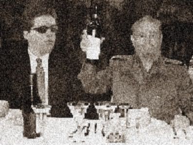 Yes, that head on the left did belong to me, once upon a time.
So, Fidel, the former president of Cuba, so long, and we'll always have our photo-manipulation.
What's going to be even more interesting is what comes next. George W. Bush has been saying for quite a while that the United States won't have anything to do with Cuba until Fidel is either out of power or dead (mainly because they thought the two would happen simultaneously). So, what is going to happen? Are we finally going to be able to travel to Cuba without making a layover in Paraguay? ...I doubt it. I think the whole "Fidel is evil, wait for him to die" argument was because politicians are lazy and don't actually want to go through the work of opening our borders to Cuba.
Of course, ol' W's on his way out, so what he says doesn't really mean much anymore. I'm not sure what the current candidates think about the Cuba thing, and goddammit, I'm too lazy to find out. What I do know, though, is that Fidel's younger brother Raul (a man who looks like a chubbier, Latino version of my high school econ teacher, Mr. Logan) probably won't make it past one election. He just doesn't have the presence for it. I mean, the man is like Luigi to Fidel's Mario.
Now, I will make no comment on Fidel's policies, communism, or politics in general (one interesting note; not even THE_BOLSHEVIK is communist). What I will comment on, though, is that he was part of one of my earliest real photoshop attempts (back before I was even using Photoshop, but rather something called "PhotoDeluxe" [a program discontinued in 2002]). It was for a Spanish project where I had to write a journal about a vacation through various Spanish-speaking countries. Well, I decided to make one of these countries be Cuba, and since I included a picture with each journal (I forget if that was required), I decided to make this one be with "Nuestro Amigo Fidel."
Yes, that head on the left did belong to me, once upon a time.So, Fidel, the former president of Cuba, so long, and we'll always have our photo-manipulation.
Saturday, February 9, 2008
Speaking of Photoshopped Things...
You know, according to Google Analytics, my currently most frequently visited post 9even more-so than the V8 Incident) is my Valentine's Eve Special. This has been due to a surge of new visitors in the last couple weeks. No real surprise there, seeing as V-Day is again upon us.
But what's interesting is that the most common entrance pathway is through Google Images. I'm pretty sure that means that everyone who is visiting is doing so because they saw this picture:
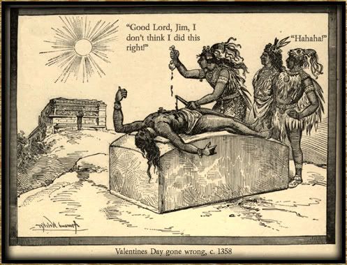 (I'm pretty sure I'm going to use this as my 2008 Valentine's Day card for my co-workers/secret admirees, by the way.)
Now, for the life of me, I don't know what people could be searching for to have this picture show up. The only things I could think of that got a result on the first page (and led to TLD) were the following:
Valentine's Eve
Jim's a jerk
Now, one really interesting I saw was when I typed in "Valentine's Day Gone Wrong". Now, this image was the very first thing to pop up. But it wasn't associated with TLD. It was on MySpace, of all things.
So, I checked it out, and saw that it was actually posted on a forum thread about things that people love by some guy named "Jim." Now, I don't care that there was no attribution; I'm happier that it's getting around, and that people like it. What I did care about was where Jim found my picture. So, I sent him a message to find out. I'm excited to see what the answer may be. As I say, seeing my creations make their way on the Internet is a true mark of pride. I'll update as soon as I learn something.
But what's interesting is that the most common entrance pathway is through Google Images. I'm pretty sure that means that everyone who is visiting is doing so because they saw this picture:
(I'm pretty sure I'm going to use this as my 2008 Valentine's Day card for my co-workers/secret admirees, by the way.)Now, for the life of me, I don't know what people could be searching for to have this picture show up. The only things I could think of that got a result on the first page (and led to TLD) were the following:
Valentine's Eve
Jim's a jerk
Now, one really interesting I saw was when I typed in "Valentine's Day Gone Wrong". Now, this image was the very first thing to pop up. But it wasn't associated with TLD. It was on MySpace, of all things.
So, I checked it out, and saw that it was actually posted on a forum thread about things that people love by some guy named "Jim." Now, I don't care that there was no attribution; I'm happier that it's getting around, and that people like it. What I did care about was where Jim found my picture. So, I sent him a message to find out. I'm excited to see what the answer may be. As I say, seeing my creations make their way on the Internet is a true mark of pride. I'll update as soon as I learn something.
Bunnies and Sunshine!!! <3 <3 <3
I haven't posted a creepy-style photoshopped picture in a while, have I?
Not since October, to be specific.
Well, let's close that gap now!
Here's something I was working on just to test what little skill I have with ImageReady (the Photoshop sister program which makes animated GIFs). I videotaped myself a couple times, and there are different effects I wanna try, so there may be more comign up.
But for the moment, enjoy!
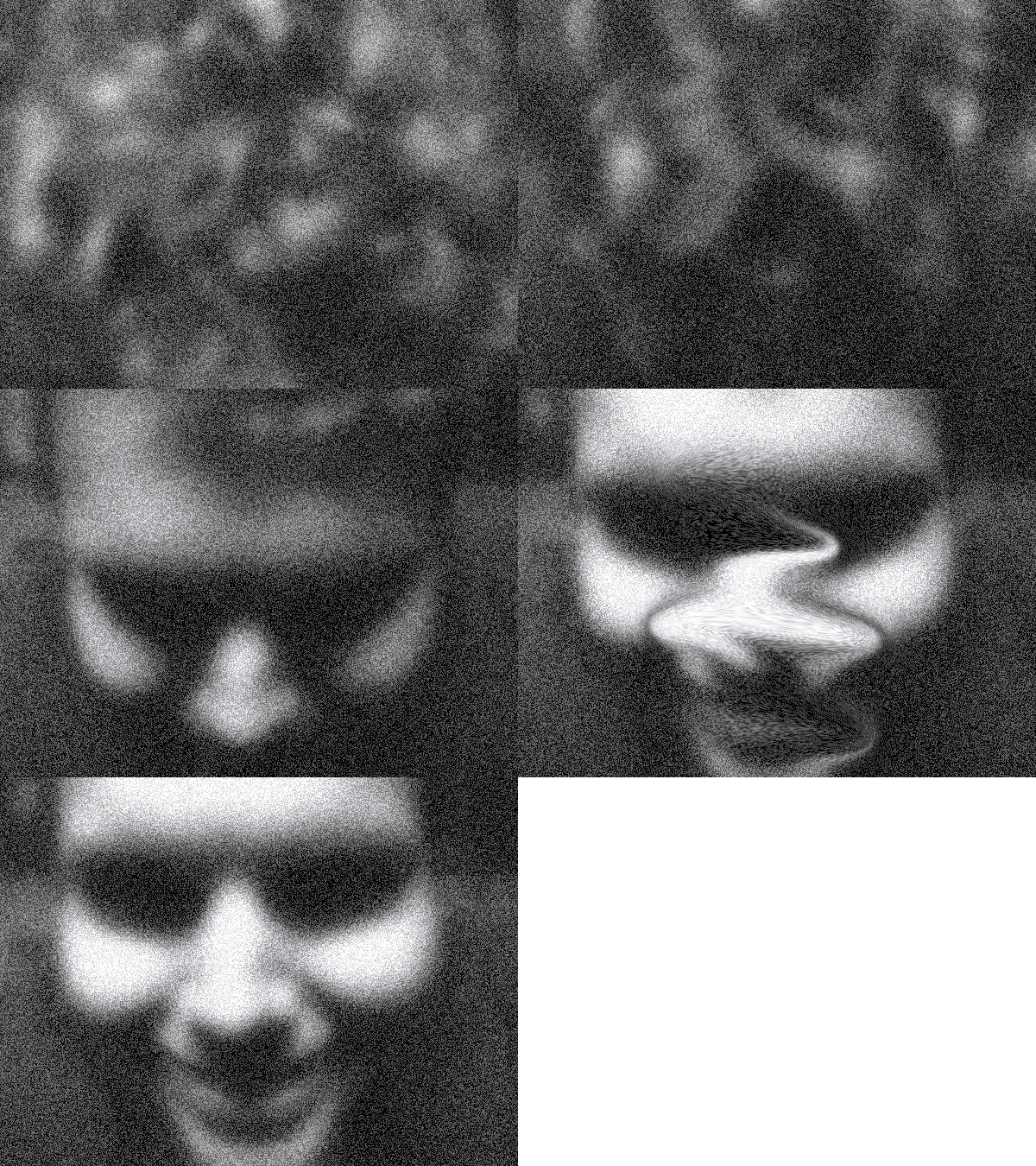
Add your own sound effects, if you don't mind.
--UPDATE--
If you'd like some thoroughly creepy music to accompany this image, TLD friend Christopher created this lovely piece.
Not since October, to be specific.
Well, let's close that gap now!
Here's something I was working on just to test what little skill I have with ImageReady (the Photoshop sister program which makes animated GIFs). I videotaped myself a couple times, and there are different effects I wanna try, so there may be more comign up.
But for the moment, enjoy!
Add your own sound effects, if you don't mind.
--UPDATE--
If you'd like some thoroughly creepy music to accompany this image, TLD friend Christopher created this lovely piece.
Tuesday, January 29, 2008
Fan Art Friday (Tuesday Edition!)
So, I often have a lot of ideas, for stories and such.
Very vivid ideas.
If you could hook some sort of screen that can see into the mind, then you'd be able to see everything I think up, even down to the most subtle cinematography.
Unfortunately, such an item does not exist. As such, I am forced to describe all my plotlines (and, as the focus of this will soon show, characters) either in words, or in picture. And since a good number of my stories have been commented on for being well-suited for graphic novels or anime, drawing does seem like it would be a good way to go.
Unfortunately, I often have a tricky time drawing my own people. I'm in no way a bad artist - I would say I'm about average - but I often fall into some bad habits. Possibly my most common habit, aside from giving every character a full-on six pack, is having them posed with both arms raised for some reason. I don't know, I guess it's just easier, but whatever.
Well, one of my high school friends & off-and-on commenter Alex is a bit more trained in the ways of the pencil than I am. He's also an easy person to share my ideas with. As such, I often get, via internet or via snail-mail, samples of artwork from him related to characters I've created.
Since this may be the closest I'll have to fan art, I thought I'd showcase some for you (with some explanations, of course).
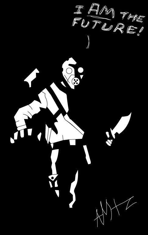
So this first one is actually from a series of pictures I was sent, but this is the one I'll focus on. The two characters shown are The Future and Carlitos del Fuego del Sol (Little Carlos of the Sun's Fire). Now, The Future isn't so much an actual honest-to-goodness character, as he was originally envisioned as a Halloween costume. Click here to see the costume. However, I can see him fitting nicely into any number of my stories as the "silent hunter" type.
Carlitos del Fuego del Sol actually is a character. He was envisioned as the primary antagonist for a series of short stories entitled "The University of Satherton" which is basically a very twisted version of Berkeley. Calitos, who was named after (but in no way similar to) my old RA friend Carlos, used to be an RA, until he was fired after shooting a resident unprovoked (the resident was sleeping). He is now an assassin, and is hired by Satherton's rival school to kill the football coaches son before the big rival match (it's to psych out the coach). He ends up fighting the main protagonist, known only as the RA (a character based on what I wish we could do). Carlitos carries four revolvers, as well as a knife, "in case there are twenty-five people to kill."
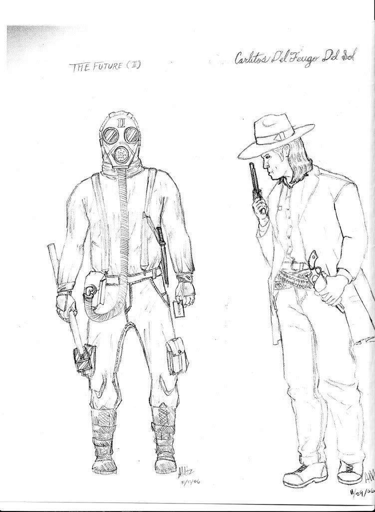 Carlitos is spot on. This version of The Future looks a little dumpy, but that could simply be because I was essentially the model for it. However, Alex recently (like, last week) sent me a new, stylized version of The Future (which has a very Sin City-like feel to it), which I thought was pretty awesome). So awesome, in fact, that I did a little tinkering, and this is now my desktop wallpaper.
 Now, if I were to make an educated guess, I would say that the character that Alex likes best is Cornelius Webster. And I wouldn't blame him. Cornelius Webster is one of my favorite characters. He comes from a series (that is, a comic or anime series) I call Menagerie. If you want an overview, you can read it here. However, Webster would work fine on his own. Here's his backstory:
Webster was "born" in 801 AD. I put that in quotation marks because he wasn't technically born. He was created. You see, Webster was a golem created by a Jewish mystic to serve Charlemagne the Great, ruler of the Holy Roman Empire. (At the time, he had no name, and was known as simply "Golem".) He called himself the Hand of God, and was able to back it up. He could see into a person's soul to see all their sins. He also has the ability to burn a person from the inside out with what he calls a "holy fire" (he basically grabs their heart and they burst into flame). Also, because he's not human, he's not easily killed. He doesn't even bleed. However, he has a serious complex. He basically despises every human, because he sees them all to be sinners. He carries a gladius with him, and his philosophy is "one cut for every sin." In essence, you could call him the epitome of a religious fanatic.
Anyway, he served Charlemagne for some time in battling the heathens of Europe. Although he didn't respect the Holy Roman Emperor, he thought that the crusade may have had some positive effect. He was invincible on the field, but didn't get along with his fellow soldiers (on account of despising them) save for one, named Remy. Remy was a young soldier, and the only person to reach out to Webster. Webster saw Remy as the sole good person on Earth, though Remy would try to convince him that most people are good, but just made mistakes.
One night, after a fierce victory, there was a large, drunken orgy in the barracks. During this period, some overly drunk soldiers beat Remy, raped him, and threw him from a high loft, killing him. When Webster saw this, he took out his gladius, and slaughtered the whole battalion of soldiers, as well as anyone else who got in his way.
When Charlemagne found out, he exiled Webster. This, of course, angered the golem. He left, but not before passing by the man carrying Charlemagne's goblet. A week later, Charlemagne was found dead.
Anyhoo, for the next millennium or so, the golem went around, fighting demons and the like, until he was contacted by the Vatican (who he had a turbulent relationship with). In the end, he agreed to stay hidden in Rome unless he was needed (there's more to it than that, but I'm trying to sum this up as quickly as possible).
I'm not sure, but I may have actually specifically asked Alex to draw Webster for me. Basically, the main color here is white. Webster wears a white coat, a white hat, and he's an albino to boot. I gave some more details, and these are some of the preliminary sketches that came about.
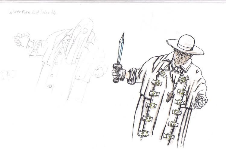
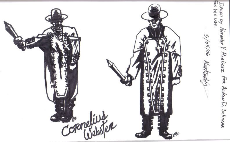 In the end, though, this was the final picture. He looks a little bit older than I envision him in my mind, but this is still the best representation of the character I have on paper (or computer) at the moment.
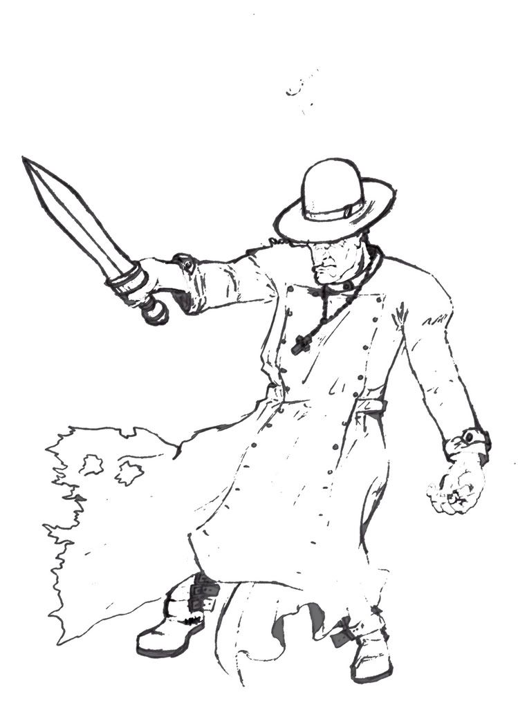 While the actual drawing may not be my forte, I can do a thing or two on Photoshop, and so I turned this drawing into...I dunno, a poster. Anyway, this is what it would be like if you saw Cornelius Webster on a dark night, complete with an original Cornelius Webster line!
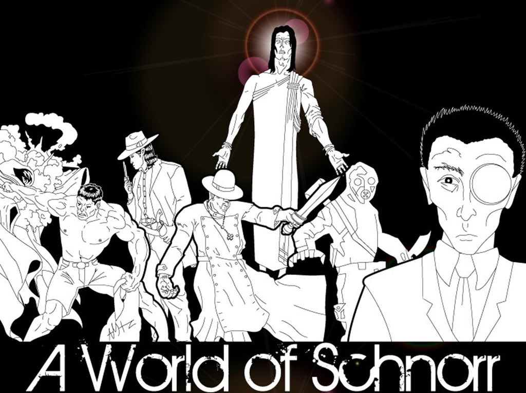
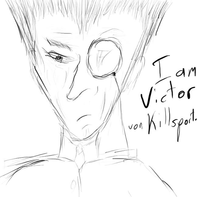
 And, in his most recent submission, Alex created this amalgamation of many different characters. Starting from the left, there's Thenosthenes, a near-immortal Spartan who lives through the centuries as a mercenary; Carlitos del Fuego del Sol, Cornelius Webster, the Neo Deus (who I'll speak of in more depth at another time), The Future, and The Lobotomist's Dream peripheral character Victor Von Killsport.
 Sensational!
Very vivid ideas.
If you could hook some sort of screen that can see into the mind, then you'd be able to see everything I think up, even down to the most subtle cinematography.
Unfortunately, such an item does not exist. As such, I am forced to describe all my plotlines (and, as the focus of this will soon show, characters) either in words, or in picture. And since a good number of my stories have been commented on for being well-suited for graphic novels or anime, drawing does seem like it would be a good way to go.
Unfortunately, I often have a tricky time drawing my own people. I'm in no way a bad artist - I would say I'm about average - but I often fall into some bad habits. Possibly my most common habit, aside from giving every character a full-on six pack, is having them posed with both arms raised for some reason. I don't know, I guess it's just easier, but whatever.
Well, one of my high school friends & off-and-on commenter Alex is a bit more trained in the ways of the pencil than I am. He's also an easy person to share my ideas with. As such, I often get, via internet or via snail-mail, samples of artwork from him related to characters I've created.
Since this may be the closest I'll have to fan art, I thought I'd showcase some for you (with some explanations, of course).
So this first one is actually from a series of pictures I was sent, but this is the one I'll focus on. The two characters shown are The Future and Carlitos del Fuego del Sol (Little Carlos of the Sun's Fire). Now, The Future isn't so much an actual honest-to-goodness character, as he was originally envisioned as a Halloween costume. Click here to see the costume. However, I can see him fitting nicely into any number of my stories as the "silent hunter" type.
Carlitos del Fuego del Sol actually is a character. He was envisioned as the primary antagonist for a series of short stories entitled "The University of Satherton" which is basically a very twisted version of Berkeley. Calitos, who was named after (but in no way similar to) my old RA friend Carlos, used to be an RA, until he was fired after shooting a resident unprovoked (the resident was sleeping). He is now an assassin, and is hired by Satherton's rival school to kill the football coaches son before the big rival match (it's to psych out the coach). He ends up fighting the main protagonist, known only as the RA (a character based on what I wish we could do). Carlitos carries four revolvers, as well as a knife, "in case there are twenty-five people to kill."
Carlitos is spot on. This version of The Future looks a little dumpy, but that could simply be because I was essentially the model for it. However, Alex recently (like, last week) sent me a new, stylized version of The Future (which has a very Sin City-like feel to it), which I thought was pretty awesome). So awesome, in fact, that I did a little tinkering, and this is now my desktop wallpaper.Now, if I were to make an educated guess, I would say that the character that Alex likes best is Cornelius Webster. And I wouldn't blame him. Cornelius Webster is one of my favorite characters. He comes from a series (that is, a comic or anime series) I call Menagerie. If you want an overview, you can read it here. However, Webster would work fine on his own. Here's his backstory:Webster was "born" in 801 AD. I put that in quotation marks because he wasn't technically born. He was created. You see, Webster was a golem created by a Jewish mystic to serve Charlemagne the Great, ruler of the Holy Roman Empire. (At the time, he had no name, and was known as simply "Golem".) He called himself the Hand of God, and was able to back it up. He could see into a person's soul to see all their sins. He also has the ability to burn a person from the inside out with what he calls a "holy fire" (he basically grabs their heart and they burst into flame). Also, because he's not human, he's not easily killed. He doesn't even bleed. However, he has a serious complex. He basically despises every human, because he sees them all to be sinners. He carries a gladius with him, and his philosophy is "one cut for every sin." In essence, you could call him the epitome of a religious fanatic.
Anyway, he served Charlemagne for some time in battling the heathens of Europe. Although he didn't respect the Holy Roman Emperor, he thought that the crusade may have had some positive effect. He was invincible on the field, but didn't get along with his fellow soldiers (on account of despising them) save for one, named Remy. Remy was a young soldier, and the only person to reach out to Webster. Webster saw Remy as the sole good person on Earth, though Remy would try to convince him that most people are good, but just made mistakes.
One night, after a fierce victory, there was a large, drunken orgy in the barracks. During this period, some overly drunk soldiers beat Remy, raped him, and threw him from a high loft, killing him. When Webster saw this, he took out his gladius, and slaughtered the whole battalion of soldiers, as well as anyone else who got in his way.
When Charlemagne found out, he exiled Webster. This, of course, angered the golem. He left, but not before passing by the man carrying Charlemagne's goblet. A week later, Charlemagne was found dead.
Anyhoo, for the next millennium or so, the golem went around, fighting demons and the like, until he was contacted by the Vatican (who he had a turbulent relationship with). In the end, he agreed to stay hidden in Rome unless he was needed (there's more to it than that, but I'm trying to sum this up as quickly as possible).
I'm not sure, but I may have actually specifically asked Alex to draw Webster for me. Basically, the main color here is white. Webster wears a white coat, a white hat, and he's an albino to boot. I gave some more details, and these are some of the preliminary sketches that came about.
In the end, though, this was the final picture. He looks a little bit older than I envision him in my mind, but this is still the best representation of the character I have on paper (or computer) at the moment.While the actual drawing may not be my forte, I can do a thing or two on Photoshop, and so I turned this drawing into...I dunno, a poster. Anyway, this is what it would be like if you saw Cornelius Webster on a dark night, complete with an original Cornelius Webster line!And, in his most recent submission, Alex created this amalgamation of many different characters. Starting from the left, there's Thenosthenes, a near-immortal Spartan who lives through the centuries as a mercenary; Carlitos del Fuego del Sol, Cornelius Webster, the Neo Deus (who I'll speak of in more depth at another time), The Future, and The Lobotomist's Dream peripheral character Victor Von Killsport.Sensational!
Sunday, October 14, 2007

Wednesday, July 18, 2007
Some Comfort...
At least I know if my writing and my business skills fail, I can always fall back on my music career.
.............
Or, at least, my CD Cover designing career.

...And now, off to bed with me!
.............
Or, at least, my CD Cover designing career.
...And now, off to bed with me!
Saturday, June 30, 2007
There are Some Men Who Never Go Out of Style...
One nice thing about having Photoshop is being able to make your own desktop backgrounds.
...Like my newest one:
 Ah, Team Praesieo would be proud!
...Like my newest one:
Ah, Team Praesieo would be proud!
Saturday, June 9, 2007
Just to Set the Record Straight


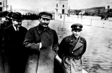
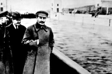
Tuesday, April 10, 2007
'Shopping Around: A Photoshop Evolution
I recently entered a Photoshop contest on a website, and did pretty well. I enjoy picture editing, and so I thought it would be an interesting opportunity to show how one goes about doing a major Photoshop edit. So, I'm going to show you the progression of my entry, from inception to completion.
(Note: Keep in mind, even though I'm going to be explaining the process, this isn't so much a tutorial as it is a look into how I think when I use Photoshop. For example, I'm not going to tell you what a "layer" is, so if you don't know...well, I guess I probably should tell you. In Photoshop, everything is in layers which go on top of a [usually blank] background. Having separate layers allows you to add and delete pieces to the picture without the fear of making serious mistakes, such as completely painting over some guy's face. You can also use them for positioning [i.e. what goes in front, what goes behind, etc.]. There, you happy now?)
Yes? Good! On we go!
So, here's the original picture (just so you know, you can click on any of these pictures to see them at full size, where you can appreciate the changes the most):
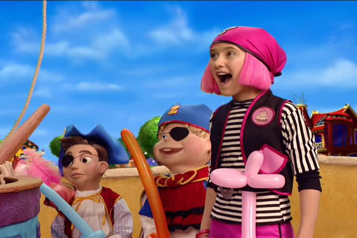 ...Yeah, don't ask me. I didn't choose it. It's apparently from some Nickelodeon show, and since I abstain from all non-nightly Nickelodeon, I haven't seen it. However, this is the picture they told us to Photoshop, and so I figured I might as well give it a shot. I love a challenge.
Step 1: Think of an idea.
This was actually the hardest of all the steps, by far. I wanted to do something original and clever, while still keeping in spirit with the original picture. Because one of the characters in this picture is a young girl, some people tried to Photoshop this into a Chris Hansen special. That's a territory I seriously wanted to stay away from, because it's (a) unoriginal and (b) not the kind of thing I do.
So, I was wracking my brain for a long time (in truth, it was about 10 minutes, but it seemed like a long time) trying to figure out my angle. Then, out of the aether from which most ideas emerge, I had a thought. What about some sort of undead-like angle? No one had really tried that before, and I could play a bit on the Pirates of the Carribean popularity.
But zombies, while funny in and of themselves on the internet, needed to be done well if I wanted any recognition for this contest. So, I set off to work.
Step 2: Create basic zombie looks.
This is the most fundamental step, I think, but turned out to be very simple. There were only two tools I used for this:
1. The "Clone Stamp" tool, which basically replicates a particular area wherever you want. I used this to make the pupil-less "blanked eye" look which I think works well for the undead. As it turns out, this is one of my favorite Photoshop tricks, as some of my other pictures will attest to.
2. The "Smudge" tool, which basically functions like you'd think it did: by smudging/smearing a piece of the picture. I used this to manipulate the two smiling characters' mouths, making it look like their faces are cut/rotting. I also used it to a lesser extend with the girl's sleeve, giving it a somewhat torn look.
And here's the result:
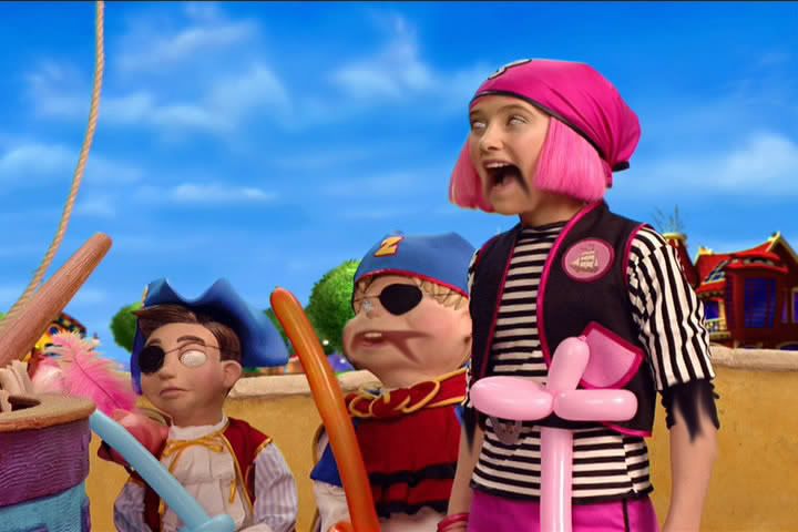 Step 3: Eliminate the background.
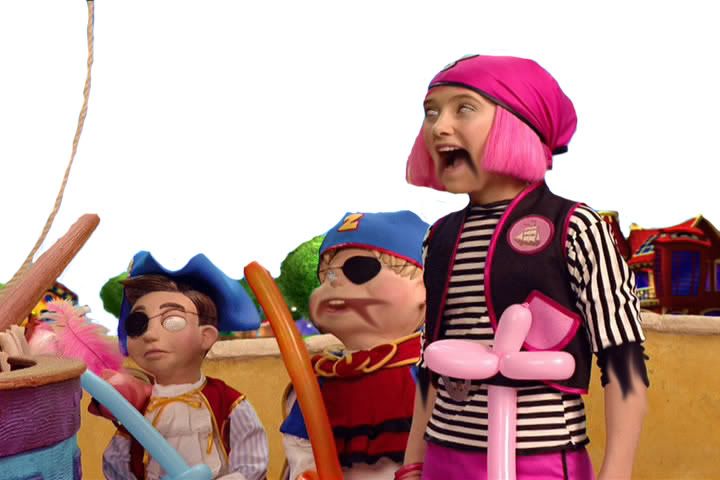
That light-blue sky with whispy clouds; that's doing nothing for me. And unless I'm trying to be ironic (which I'm not), it's not going to work juxtaposing it with such a horrific foreground. So, let's take it out, shall we? This was a simple job for the "eraser" tool.
Step 4: Add new and improved background.
What innocent part of nature is practically synonymous with evil? Lightning, of course! (Which is in truth quite unfair to lightning; c'mon, people, it's just a large buildup of static electricity. You think it's funny and cute when a balloon makes your hair stand, but when it's in large quantities, it's suddenly the embodiement of all things unholy. Sheesh. But I digress.) So, I did a Google search for lightning, copied the first picture I found, resized it a bit, and pasted it behind the foreground layer.
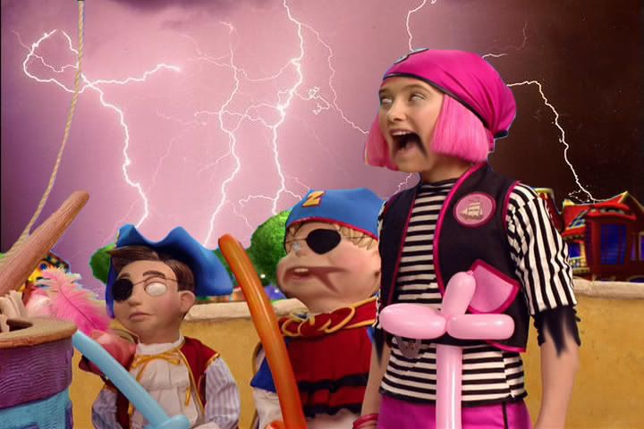 I particularly like the lightning that appears to be striking the house on the right (with the little flourish and everything). That was completely unintentional, but awesome nonetheless.
Step 5: Give them undead coloring.
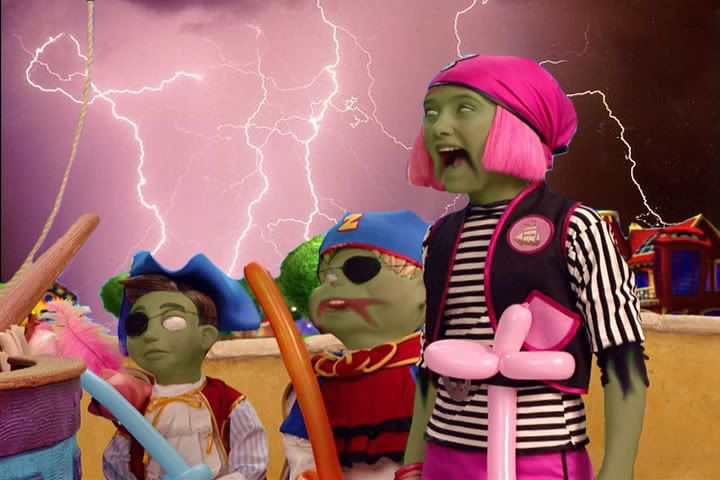
Of course, something's been missing. Even though they have the look and background of the walking dead, our heroes have very human coloring. That surely won't do. Let's give them a couple weeks of death more to produce that lovely gangrene look. We do this by creating a new layer (I actually made a new layer for each character, but that's just semantics) and painting over all skin layers with a dark green color. You then change the transparency of this layer so it's no longer opaque. I made my transparency 35%, and ended up with the following.
Step 6: Give sleepy-eyes.
This is very minor (in fact, you probably have to look at both pictures large to see the change), but in my opinion, essential. In order to really clinch the whole zombie look, it is essential to have dark rings around the eyes to give them that sunk-back look. It really makes the difference betwixt "zombie" and "person who fell into a bunch of green dye." It's basically the same deal as the skin; just a new layer with some transparent black paint around the eyes.
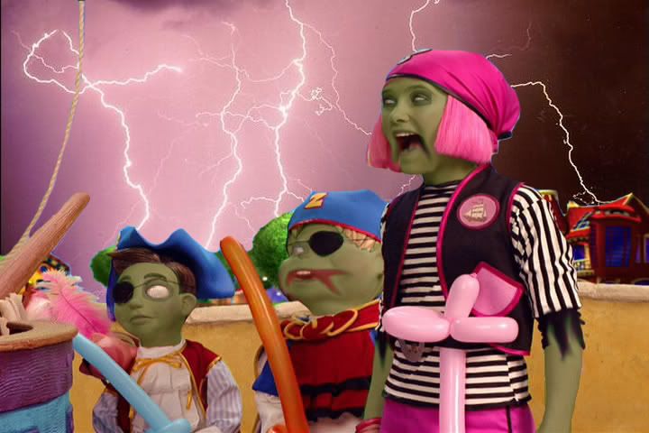
Step 7: Add a prop for extra potency.
There's a lot of things I could have done for this one. I could have added actual swords, ships masts, ghosts, what have you. However, I thought to myself, "They pirates, and they're zombies. What do they have in common?" Suddenly, it came to me: cutting off people's heads (or, in a zombie's case, ripping it off). So I did a search for heads (and only heads). This was actually a very difficult search, because I'd either get anatomical drawings, random head-shots, or pictures so grotesque that I wouldn't even think to use them.
Eventually, though, I found a party-store site with a fake "skinned head" that I thought meshed well with the zombie theme. The balloon swords in the picture were going to a terrible waste, so I thought I should take advantage of one by impaling the head on it.

Let's stop here for a second. This was my original vision when I started the process, and I had now reached it. I could submit the piece now. However, when looking at it, I wasn't satisfied. There was something...not quite right about the picture. After a little bit of thinking, I realized the problem. It's too bright! The foreground is still too bright and chipper to really get the point across. It had to be darkened to achieve its full potential. And so, I decided to go ahead and keep editing it.
And now, let's continue where we left of.
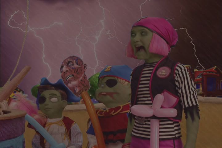
Step 8: Darken it up/add rain for atmosphere.
At first I just added a new layer, filled it all with black paint, and lowered the transparency. This worked alright, but it just darkened the picture without really adding anything. So, I tried a little trick to make it appear as though it were raining. Here's how it goes:
-Fill in the layer with a dark gray (pure black doesn't work).
-Use the "Smudge Stick" filter with the settings set to their maximums. This gives the layer diagonal streaks.
-Lower the transparency. This gives the look of a raging storm (particularly with the lightning in the background), and you're left with the following:
Step 9: Make it actually rain.
Once again, I wasn't satisfied with how my final product turned out. It was too...too...motionless. I needed a dynamic element. So, I decided to turn this baby from a JPEG into an animated GIF. I did this by increasing the size of the "rain" layer (which actually made it look slightly more realistic) and, using Adobe ImageReady, made 5 frames of animation, in each of which I moved the rain slightly. The result is the following.
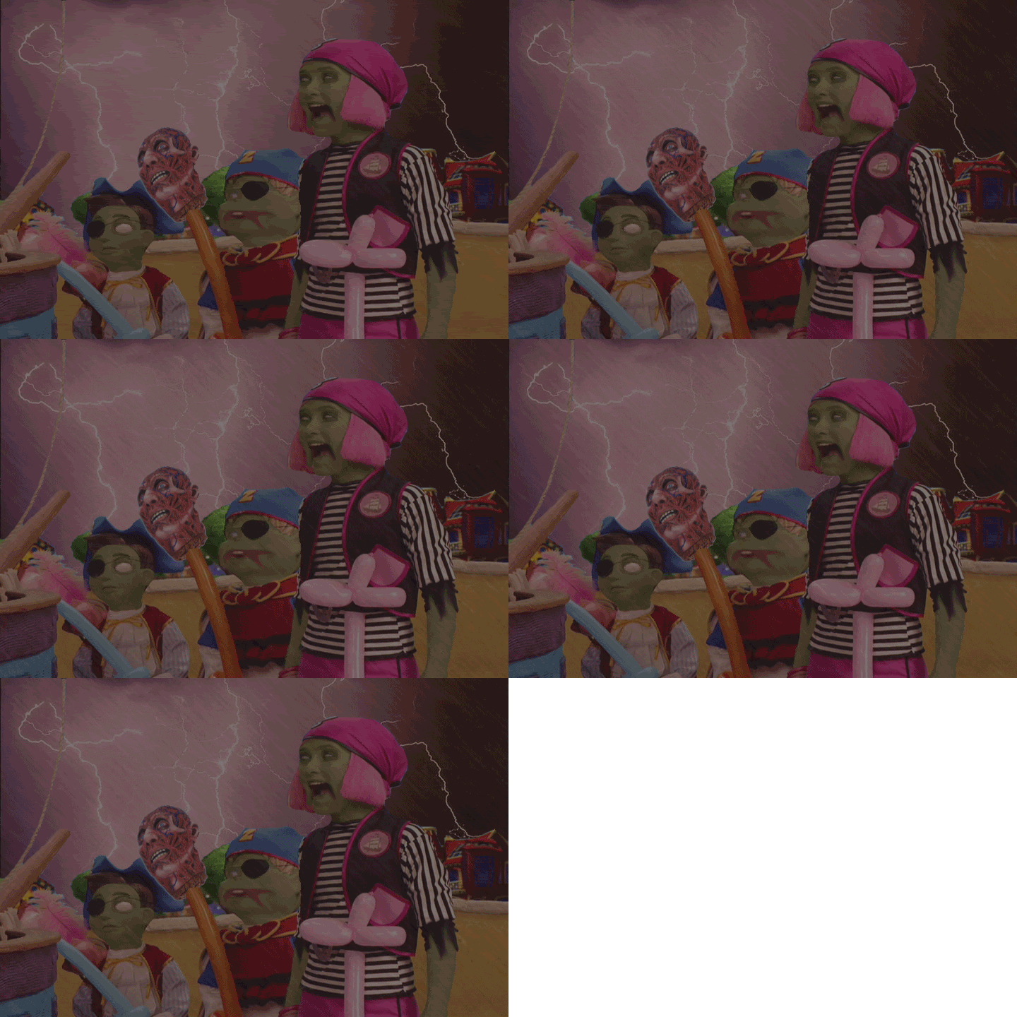 Amazing what a little motion will do, eh?
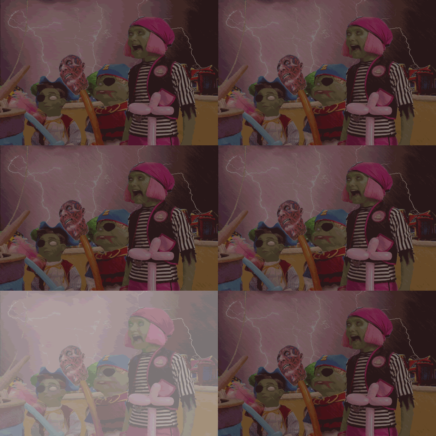
Step 10: Add lightning.
Rain is all fine and good, but if you really want to give the appearance of a storm, what better way than with ourevil misunderstood friend lightning. So, I basically duplicated the animation frames a bunch, and then added a few white screens here and there. Not too complicated, really.
Step 11: Add sound and finish it up!
One of the interesting things about the site on which the contest was is the fact that you are allowed/required to add sound. This can really make or break your entry. Luckily, I caught a break. I had previously created a music loop using the song "The Kraken" from Hans Zimmer's Pirates of the Carribean 2 soundtrack. Actually, I only used a small piece from the end of the song, as it loops almost flawlessly. However, up until this point, I have not found a use for that clip. I thought this would be the perfect picture to match it with.
And so, with all that put together, I submitted my entry for the Photoshop contest, in what I entitled "They've Caught the Curse!!!" As they say, "Tada!"
Well, I hope you've enjoyed this look at my Photoshopping. I also hope that you've learned how managable it can be; what may appear to be a complex edit is really just a series of simple edits, with the idea being the hardest part. My entry turned out to be the highest-rated (and most consistently highly-rated) in the contest, as well as the most-viewed. I'd definitely consider that a success under any circumstance, even though it didn't win. And I hope you all at least try some photo-editing one of these days, be it with Photoshop or some other program (and don't worry if you don't have much experience; everything I know, I learned by experimentation and a Google search here and there). It's a challenge, it's fun, and you might just find that you have a knack for it.
Happy 'shopping!
(Note: Keep in mind, even though I'm going to be explaining the process, this isn't so much a tutorial as it is a look into how I think when I use Photoshop. For example, I'm not going to tell you what a "layer" is, so if you don't know...well, I guess I probably should tell you. In Photoshop, everything is in layers which go on top of a [usually blank] background. Having separate layers allows you to add and delete pieces to the picture without the fear of making serious mistakes, such as completely painting over some guy's face. You can also use them for positioning [i.e. what goes in front, what goes behind, etc.]. There, you happy now?)
Yes? Good! On we go!
So, here's the original picture (just so you know, you can click on any of these pictures to see them at full size, where you can appreciate the changes the most):
...Yeah, don't ask me. I didn't choose it. It's apparently from some Nickelodeon show, and since I abstain from all non-nightly Nickelodeon, I haven't seen it. However, this is the picture they told us to Photoshop, and so I figured I might as well give it a shot. I love a challenge.Step 1: Think of an idea.
This was actually the hardest of all the steps, by far. I wanted to do something original and clever, while still keeping in spirit with the original picture. Because one of the characters in this picture is a young girl, some people tried to Photoshop this into a Chris Hansen special. That's a territory I seriously wanted to stay away from, because it's (a) unoriginal and (b) not the kind of thing I do.
So, I was wracking my brain for a long time (in truth, it was about 10 minutes, but it seemed like a long time) trying to figure out my angle. Then, out of the aether from which most ideas emerge, I had a thought. What about some sort of undead-like angle? No one had really tried that before, and I could play a bit on the Pirates of the Carribean popularity.
But zombies, while funny in and of themselves on the internet, needed to be done well if I wanted any recognition for this contest. So, I set off to work.
Step 2: Create basic zombie looks.
This is the most fundamental step, I think, but turned out to be very simple. There were only two tools I used for this:
1. The "Clone Stamp" tool, which basically replicates a particular area wherever you want. I used this to make the pupil-less "blanked eye" look which I think works well for the undead. As it turns out, this is one of my favorite Photoshop tricks, as some of my other pictures will attest to.
2. The "Smudge" tool, which basically functions like you'd think it did: by smudging/smearing a piece of the picture. I used this to manipulate the two smiling characters' mouths, making it look like their faces are cut/rotting. I also used it to a lesser extend with the girl's sleeve, giving it a somewhat torn look.
And here's the result:
Step 3: Eliminate the background.That light-blue sky with whispy clouds; that's doing nothing for me. And unless I'm trying to be ironic (which I'm not), it's not going to work juxtaposing it with such a horrific foreground. So, let's take it out, shall we? This was a simple job for the "eraser" tool.
Step 4: Add new and improved background.
What innocent part of nature is practically synonymous with evil? Lightning, of course! (Which is in truth quite unfair to lightning; c'mon, people, it's just a large buildup of static electricity. You think it's funny and cute when a balloon makes your hair stand, but when it's in large quantities, it's suddenly the embodiement of all things unholy. Sheesh. But I digress.) So, I did a Google search for lightning, copied the first picture I found, resized it a bit, and pasted it behind the foreground layer.
I particularly like the lightning that appears to be striking the house on the right (with the little flourish and everything). That was completely unintentional, but awesome nonetheless.Step 5: Give them undead coloring.
Of course, something's been missing. Even though they have the look and background of the walking dead, our heroes have very human coloring. That surely won't do. Let's give them a couple weeks of death more to produce that lovely gangrene look. We do this by creating a new layer (I actually made a new layer for each character, but that's just semantics) and painting over all skin layers with a dark green color. You then change the transparency of this layer so it's no longer opaque. I made my transparency 35%, and ended up with the following.
Step 6: Give sleepy-eyes.
This is very minor (in fact, you probably have to look at both pictures large to see the change), but in my opinion, essential. In order to really clinch the whole zombie look, it is essential to have dark rings around the eyes to give them that sunk-back look. It really makes the difference betwixt "zombie" and "person who fell into a bunch of green dye." It's basically the same deal as the skin; just a new layer with some transparent black paint around the eyes.
Step 7: Add a prop for extra potency.
There's a lot of things I could have done for this one. I could have added actual swords, ships masts, ghosts, what have you. However, I thought to myself, "They pirates, and they're zombies. What do they have in common?" Suddenly, it came to me: cutting off people's heads (or, in a zombie's case, ripping it off). So I did a search for heads (and only heads). This was actually a very difficult search, because I'd either get anatomical drawings, random head-shots, or pictures so grotesque that I wouldn't even think to use them.
Eventually, though, I found a party-store site with a fake "skinned head" that I thought meshed well with the zombie theme. The balloon swords in the picture were going to a terrible waste, so I thought I should take advantage of one by impaling the head on it.
Let's stop here for a second. This was my original vision when I started the process, and I had now reached it. I could submit the piece now. However, when looking at it, I wasn't satisfied. There was something...not quite right about the picture. After a little bit of thinking, I realized the problem. It's too bright! The foreground is still too bright and chipper to really get the point across. It had to be darkened to achieve its full potential. And so, I decided to go ahead and keep editing it.
And now, let's continue where we left of.
Step 8: Darken it up/add rain for atmosphere.
At first I just added a new layer, filled it all with black paint, and lowered the transparency. This worked alright, but it just darkened the picture without really adding anything. So, I tried a little trick to make it appear as though it were raining. Here's how it goes:
-Fill in the layer with a dark gray (pure black doesn't work).
-Use the "Smudge Stick" filter with the settings set to their maximums. This gives the layer diagonal streaks.
-Lower the transparency. This gives the look of a raging storm (particularly with the lightning in the background), and you're left with the following:
Step 9: Make it actually rain.
Once again, I wasn't satisfied with how my final product turned out. It was too...too...motionless. I needed a dynamic element. So, I decided to turn this baby from a JPEG into an animated GIF. I did this by increasing the size of the "rain" layer (which actually made it look slightly more realistic) and, using Adobe ImageReady, made 5 frames of animation, in each of which I moved the rain slightly. The result is the following.
Amazing what a little motion will do, eh?Step 10: Add lightning.
Rain is all fine and good, but if you really want to give the appearance of a storm, what better way than with our
Step 11: Add sound and finish it up!
One of the interesting things about the site on which the contest was is the fact that you are allowed/required to add sound. This can really make or break your entry. Luckily, I caught a break. I had previously created a music loop using the song "The Kraken" from Hans Zimmer's Pirates of the Carribean 2 soundtrack. Actually, I only used a small piece from the end of the song, as it loops almost flawlessly. However, up until this point, I have not found a use for that clip. I thought this would be the perfect picture to match it with.
And so, with all that put together, I submitted my entry for the Photoshop contest, in what I entitled "They've Caught the Curse!!!" As they say, "Tada!"
Well, I hope you've enjoyed this look at my Photoshopping. I also hope that you've learned how managable it can be; what may appear to be a complex edit is really just a series of simple edits, with the idea being the hardest part. My entry turned out to be the highest-rated (and most consistently highly-rated) in the contest, as well as the most-viewed. I'd definitely consider that a success under any circumstance, even though it didn't win. And I hope you all at least try some photo-editing one of these days, be it with Photoshop or some other program (and don't worry if you don't have much experience; everything I know, I learned by experimentation and a Google search here and there). It's a challenge, it's fun, and you might just find that you have a knack for it.
Happy 'shopping!
Monday, April 2, 2007
This Won't Make a Lick of Sense if You Don't go to Cal...
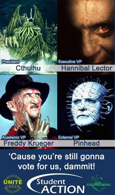
EDIT: I originally was planning on posting the picture by itself, perhaps explaining it another day, but then I realized I'm not that mean. (If you're a Berkeley student, you can probably skip this unless you want to hear a political rant.)
Right now at UC Berkeley (and, I'm assuming, at a lot of campuses), we're having our Associated Student of the UC (or ASUC, conveniently rhyming with "they suck") elections, better known as "they worst period of the academic year."
During the upcoming weeks, practically no sidewalk in Berkeley will go unchalked. No moron will go without holding up a picket sign for someone he's never met, just so he can get a few bucks an hour. No flyer will miss the epic journey from printer to hand to hand to trash. And no Cal student, regardless of how much he loves or hates politics, will go without hearing the words "Student Action."
Student Action is a "political party," the campus equivalent of the Democrats or Republicans. Actually, make that the Democrats and Republicans. Because, you see, at Berkeley, one of democracy's cities on a hill, we essentially have a one-party system. And that party is Student Action.
If one were to look on Facebook right now, you'd see a disgustingly large number of people with this ad as their profile picture (consequently, it's the ad I'm parodying). But Student Action doesn't stop there. No, they love to flood the campus with flyers about how they've instated yet another gelato lounge on Sproul...while conveniently forgetting to mention the fact that to do so, they tore down a beloved arcade and multi-school community center (which didn't fill their pockets like the ice cream money does).

Student Action is a self-aggrandizing, self-glorifying, elitist club who claims to serve the students but time and time again has done projects - projects that no one asked for - which conveniently gave them a revenue source. And, like any political organization, it is not about a heaping helping of foul play.
And yet, year after year, the people in this party are voted into office without fail for the simple reason that the names of their candidates have been pounded into students again and again (along with the normal assortment of empty promises) through all heavy, high-priced advertising.
One word comes to mind when I think of this scenario (though, in fact, it's two words): "Political Machine." Basically, if you want to get elected, you pretty much have to be part of Student Action (or, at the very least, on their good side). Is Student Action the new Tammany? Thankfully, no. But, as far as campus politics go, it's pretty damn close. Here's their cycle of power:
1) Use expensive, ubiquitous advertising around campus, hammering knowledge of you into the poor, unsuspecting voter.
2) The voters choose you for the mere fact that yours was the only name they recognized on the ballot.
3) You're in! Hooray!
4) Hurry, start some projects that will make you and Student Action lots of revenue.
5) Harvest the green cash money.
6) Lather, rinse, repeat.
Needless to say, I'm not voting for them. Well, I'm not voting at all (I hate politics, after all), but if I was, I wouldn't vote for them. Hell, I even have an aquaintence/co-worker running for VP, and I would have no intention of voting for her. But don't you worry: she'll make it. I'm so confident of that, in fact, that I was thinking to myself today, "You know, you could have all evil monsters running, but as long as they were part of Student Action, they'd get voted in."
And thus, my little fake ad was born. And now all you non-Berkeleyans get it...or, at least, you should...
Friday, February 9, 2007
Required Reading
I write a lot. A lot. But I'm sure you've already figured that out by looking at how small the scroll bar is on the right. Because many of the people reading this blog have not known me particularly long, I almost feel tempted to exploit that ignorance by posting things I've written elsewhere and claiming it as fresh and new.
I'm not that lazy, of course. However, I still believe that my previous works are of merit and do deserve to be looked at. After all, you can learn a lot about someone is through their writing. So I decided to create this post of "required reading." If you're going to bookmark only one of my posts, this should be it, because you may have to come back several times to read it all. Then again, that's why I'm posting this on aFriday Saturday morning; you'll have all weekend to look through it all, if you so choose.
So let's get started, shall we? What's on the syllabus?
Oh, of course. We should get started with The Tapping Wand.

As you can see by the name of the cover of this book, I am the author. No foolin'. There's a little bit of a story behind this. Originally, I wrote The Tapping Wand for a Sci-Fi/Fantasy short story contest. It was about 40 pages long, which I thought was fine, as the rules of the contest specified that the story had to be betwixt 15 and 50 pages. However, the part of the rules I neglected to read had an evil, evil hyphenated word: "Double-spaced". Suddenly, I was disqualified from the competition. However, people liked the story, and they told me I should have it published. So...I did. (It wasn't nearly as simple as that last statement made it seem.) I think it's a good story, so I like to shamelessly plug it whenever the opportunity arrises. You can get more information about the book by clicking the picture, and you can see that this isn't all an elaborate hoax by looking at the Amazon page for it.
Seriously, though, if you actually do have an interest in the book, I recommend you buy it directly from me. You won't pay tax or shipping, you'll get it right away, and I'll personally sign it (plus, I'll get more money that way).
Next on the agenda, we'll look at my blog on MySpace. I've utilized my MySpace blog much differently than I'm utilizing this one. First of all, the posts are much more sporadic, and as time went on, it focused much more on mixing photographs with words. Still, it represents a boatload of work hours, and it'd be nice for some of the older, forgotten posts to get another chance in the spotlight.
I warn you, unless you own a decent computer, don't open all of these at once. The bandwidth will melt your motherboard and make the Internet cry.
What's your ONN? : This was the first blog entry, and to be honest, it shows. I am still damn proud of my Official Nerd Number equation, but I definitely feel it needs tinkering. It is my dream to eventually make a website where you enter in the variables, and it will calculate your ONN for you. The hope would then be that users can then submit their own claculators and such, and you could post your answers, like with those quiz sites. It's still possible, especially now that I'm learning JavaScript and the like. Give it a shot, in any event, it's pretty fun.
The Obligatory Love Blog... : Hmm...this one is an interesting creature. I don't necessarily agree with it anymore, yet I don't necessarily disagree either. Where exactly do I now stand on the topic of love? That's a topic for another day, young one. For now, I'll just say that I give a good description of iambic pentameter.
Vietnamization! : I'm still really proud of this. You'd be amazed how difficult to make a song parody that works while being somewhat historically accurate.
Menagerie Overview : I have dozens, if not hundreds, of stories flying through my brain. Believe it or not, this can actually be a hindrance to actually finishing a story I start. But anyway, Menagerie is an idea I have for a graphic novel or short (50-episode) TV series. I decided to write a little overview to give people an idea of the show, and also to store down some of the information, so I wouldn't forget it later (me forgetting a story element is rare, but does occur). Just so you know, if there was ever a spin-off of this, it would star Cornelius Webster, who a friend of mine graciously illustrated for me.
MONARCH, Chapter One (Teaser) : I have three main genres that I like to write in (or some combination of the three) - Fantasy/Sci-Fi, Horror, and Comedy. MONARCH definitely falls under the latter category. I've actually finished quite a bit more than this, and if you'd definitely like to read more, just ask.
My Opprobrium - A Poem : Just a simple poem. Although I agree that not all poetry needs to rhyme, you just can't deny that it adds a special something.
Sapphire - A Dream : A MUST-READ! I love this short story to an unhealthy degree. It is, by a wide margin, one of the creepiest things I have ever written, but I think that adds to its charm. As I say, if you read only one thing on here, read this. And don't worry; it's just story...just a story.
A Story That Goes Nowhere : This one's a hoot. I laughed as I was rereading it. In order to get the full effect of this, you have to read it out loud in your best old person voice. This was directly inspired by (and in a couple places, copied from) Grampa Simpson, king of ramblers.
SAHS Prom 2005 - A Pictoral Recap : This was the first of my many photo-blogs. It's a little overview of my Senior Prom in high school. Back then, I thought it was a lot of work to make one of these (as you'll later see, it was nothing compared to what I'd later post). One thing to keep in mind that I was nominated as a potential Prom King that year. (You'll find out the results at the end). This look at the "good ol' days" is a nice way to see some of the people I went to high school with, and you get to see what I looked like before I grew a goatee. "How shocking!"
Phun With Photoshop!!! : This was one of the first times I really did any serious Photoshopping. At the time, though, I didn't actually use "Photoshop." I used "Adobe Photo Deluxe". That, combined with my novice skills, makes this seem much less impressive to me now than it did oh so long ago. My Photoshop skills have improved substantially since then (as you can tell from my background image), but everyone has to start somewhere. Something funny: although that last (non-edited) picture of me is god-ugly, it has been the source of a lot of great creepy looking Photoshops. Here's another example. You know, I really need to do a "Phun With Photoshop II" soon...
What it's like at the CKC! A Story in Pictures (and Words)... : This is probably not as interesting to people who know what Berkeley's like, but it's a fun read regardless. I also think that picture of me by Sather Gate needs to be a publicity photo for...well, something!
Two-Minute Photo-Shoot! Pre-Prom 2006 Edition!!! : This was more fun to do than it was to write. As you can tell by the title, this was all the pictures I could take in two minutes while wearing a nice suit (and sometimes having a fake cigar). If nothing else, this has a lot of really nice, quality pictures of me, which I always consider a blessing upon the world.
My Trip to Comic-Con 2006!!! HUGE BLOG!!! 100+ PICTURES!!! : This is a behemoth. An honest-to-goodness leviathan. If you copy and paste it to a Word document, it extends for 116 pages. This has it all. Superheroes! Hot alien women! Ghostbusters! Verbal jabs at Nicholas Cage! Pirates! Swords! Stan Lee! Muscles! Games! Lightsaber battles. And most importantly...me! It also includes pictures of my pride and joy of the convention, my Comic-Con notebook. It's one of my more fun blogs, or so I'm told.
My Halloween Costume - 2006 : For the past five years, my Halloween costumes have allowed me to be completely silent while wearing them. From 2002 - 2005, I dressed as a deliciously creepy mime, whose creepiness is exacerbated when combined with my pale, pudgy torso. This past Halloween, however, I went with something completely unique, and it got quite a positive response...from those who weren't freaked out of their mind. This also inspired my artist friend to illustrate "The Future". Oh, yeah, and I still think the last picture is funny.
What's Black and White and Read All Over? This B&W BLOG!!! : I still believe this is the best way to do artistic photo-editing if you don't have Photoshop. (If you do have the program, however, the equivalent filter is "Torn Edges".) This also explains where I got my little profile picture and why I like it so much.
And that's all the required reading I have for you. Feel free to look at the rest of my MySpace profile. You can also always Google my name (it works best if you use quotation marks). I have a little artwork on website, I write news articles for Effectu, a tech news site, and I appear in a few other places. Plenty of material for those cold rainy nights.
Happy reading!
I'm not that lazy, of course. However, I still believe that my previous works are of merit and do deserve to be looked at. After all, you can learn a lot about someone is through their writing. So I decided to create this post of "required reading." If you're going to bookmark only one of my posts, this should be it, because you may have to come back several times to read it all. Then again, that's why I'm posting this on a
So let's get started, shall we? What's on the syllabus?
Oh, of course. We should get started with The Tapping Wand.
As you can see by the name of the cover of this book, I am the author. No foolin'. There's a little bit of a story behind this. Originally, I wrote The Tapping Wand for a Sci-Fi/Fantasy short story contest. It was about 40 pages long, which I thought was fine, as the rules of the contest specified that the story had to be betwixt 15 and 50 pages. However, the part of the rules I neglected to read had an evil, evil hyphenated word: "Double-spaced". Suddenly, I was disqualified from the competition. However, people liked the story, and they told me I should have it published. So...I did. (It wasn't nearly as simple as that last statement made it seem.) I think it's a good story, so I like to shamelessly plug it whenever the opportunity arrises. You can get more information about the book by clicking the picture, and you can see that this isn't all an elaborate hoax by looking at the Amazon page for it.
Seriously, though, if you actually do have an interest in the book, I recommend you buy it directly from me. You won't pay tax or shipping, you'll get it right away, and I'll personally sign it (plus, I'll get more money that way).
Next on the agenda, we'll look at my blog on MySpace. I've utilized my MySpace blog much differently than I'm utilizing this one. First of all, the posts are much more sporadic, and as time went on, it focused much more on mixing photographs with words. Still, it represents a boatload of work hours, and it'd be nice for some of the older, forgotten posts to get another chance in the spotlight.
I warn you, unless you own a decent computer, don't open all of these at once. The bandwidth will melt your motherboard and make the Internet cry.
What's your ONN? : This was the first blog entry, and to be honest, it shows. I am still damn proud of my Official Nerd Number equation, but I definitely feel it needs tinkering. It is my dream to eventually make a website where you enter in the variables, and it will calculate your ONN for you. The hope would then be that users can then submit their own claculators and such, and you could post your answers, like with those quiz sites. It's still possible, especially now that I'm learning JavaScript and the like. Give it a shot, in any event, it's pretty fun.
The Obligatory Love Blog... : Hmm...this one is an interesting creature. I don't necessarily agree with it anymore, yet I don't necessarily disagree either. Where exactly do I now stand on the topic of love? That's a topic for another day, young one. For now, I'll just say that I give a good description of iambic pentameter.
Vietnamization! : I'm still really proud of this. You'd be amazed how difficult to make a song parody that works while being somewhat historically accurate.
Menagerie Overview : I have dozens, if not hundreds, of stories flying through my brain. Believe it or not, this can actually be a hindrance to actually finishing a story I start. But anyway, Menagerie is an idea I have for a graphic novel or short (50-episode) TV series. I decided to write a little overview to give people an idea of the show, and also to store down some of the information, so I wouldn't forget it later (me forgetting a story element is rare, but does occur). Just so you know, if there was ever a spin-off of this, it would star Cornelius Webster, who a friend of mine graciously illustrated for me.
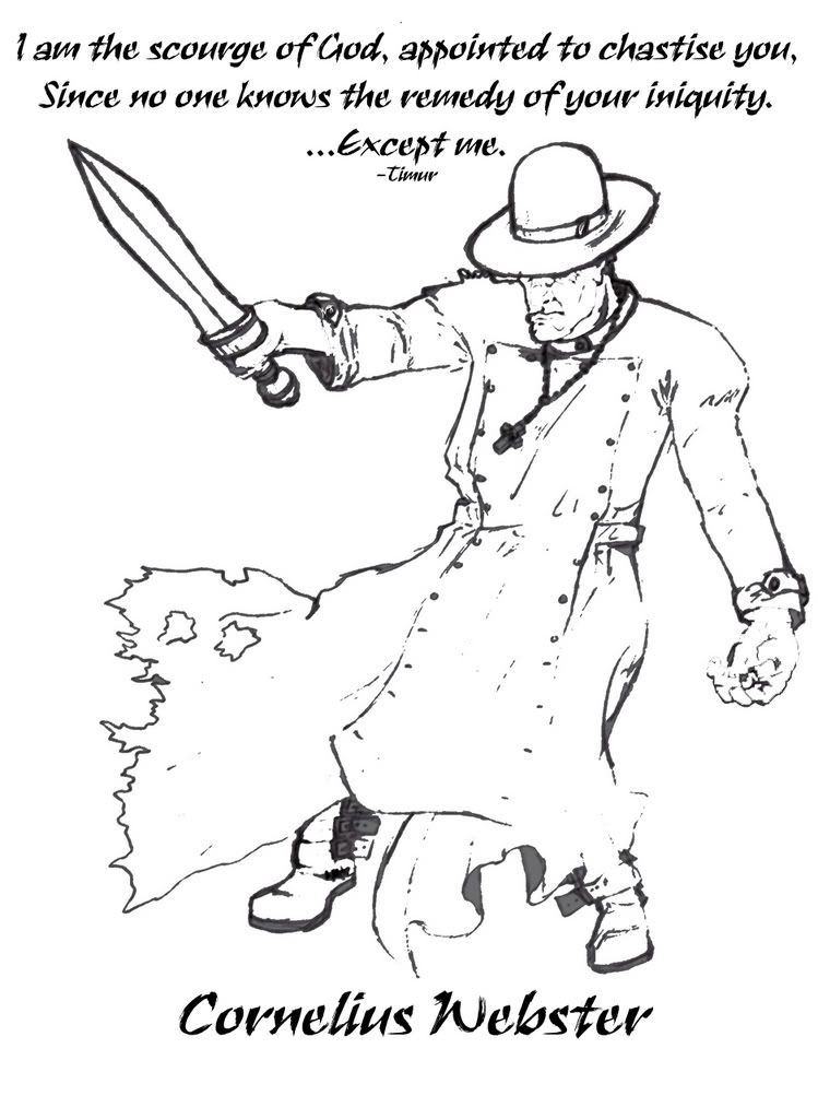
MONARCH, Chapter One (Teaser) : I have three main genres that I like to write in (or some combination of the three) - Fantasy/Sci-Fi, Horror, and Comedy. MONARCH definitely falls under the latter category. I've actually finished quite a bit more than this, and if you'd definitely like to read more, just ask.
My Opprobrium - A Poem : Just a simple poem. Although I agree that not all poetry needs to rhyme, you just can't deny that it adds a special something.
Sapphire - A Dream : A MUST-READ! I love this short story to an unhealthy degree. It is, by a wide margin, one of the creepiest things I have ever written, but I think that adds to its charm. As I say, if you read only one thing on here, read this. And don't worry; it's just story...just a story.
A Story That Goes Nowhere : This one's a hoot. I laughed as I was rereading it. In order to get the full effect of this, you have to read it out loud in your best old person voice. This was directly inspired by (and in a couple places, copied from) Grampa Simpson, king of ramblers.
SAHS Prom 2005 - A Pictoral Recap : This was the first of my many photo-blogs. It's a little overview of my Senior Prom in high school. Back then, I thought it was a lot of work to make one of these (as you'll later see, it was nothing compared to what I'd later post). One thing to keep in mind that I was nominated as a potential Prom King that year. (You'll find out the results at the end). This look at the "good ol' days" is a nice way to see some of the people I went to high school with, and you get to see what I looked like before I grew a goatee. "How shocking!"
Phun With Photoshop!!! : This was one of the first times I really did any serious Photoshopping. At the time, though, I didn't actually use "Photoshop." I used "Adobe Photo Deluxe". That, combined with my novice skills, makes this seem much less impressive to me now than it did oh so long ago. My Photoshop skills have improved substantially since then (as you can tell from my background image), but everyone has to start somewhere. Something funny: although that last (non-edited) picture of me is god-ugly, it has been the source of a lot of great creepy looking Photoshops. Here's another example. You know, I really need to do a "Phun With Photoshop II" soon...
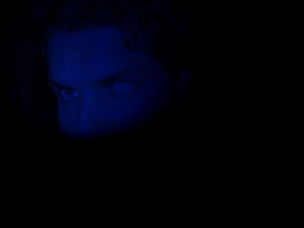
What it's like at the CKC! A Story in Pictures (and Words)... : This is probably not as interesting to people who know what Berkeley's like, but it's a fun read regardless. I also think that picture of me by Sather Gate needs to be a publicity photo for...well, something!
Two-Minute Photo-Shoot! Pre-Prom 2006 Edition!!! : This was more fun to do than it was to write. As you can tell by the title, this was all the pictures I could take in two minutes while wearing a nice suit (and sometimes having a fake cigar). If nothing else, this has a lot of really nice, quality pictures of me, which I always consider a blessing upon the world.
My Trip to Comic-Con 2006!!! HUGE BLOG!!! 100+ PICTURES!!! : This is a behemoth. An honest-to-goodness leviathan. If you copy and paste it to a Word document, it extends for 116 pages. This has it all. Superheroes! Hot alien women! Ghostbusters! Verbal jabs at Nicholas Cage! Pirates! Swords! Stan Lee! Muscles! Games! Lightsaber battles. And most importantly...me! It also includes pictures of my pride and joy of the convention, my Comic-Con notebook. It's one of my more fun blogs, or so I'm told.
My Halloween Costume - 2006 : For the past five years, my Halloween costumes have allowed me to be completely silent while wearing them. From 2002 - 2005, I dressed as a deliciously creepy mime, whose creepiness is exacerbated when combined with my pale, pudgy torso. This past Halloween, however, I went with something completely unique, and it got quite a positive response...from those who weren't freaked out of their mind. This also inspired my artist friend to illustrate "The Future". Oh, yeah, and I still think the last picture is funny.

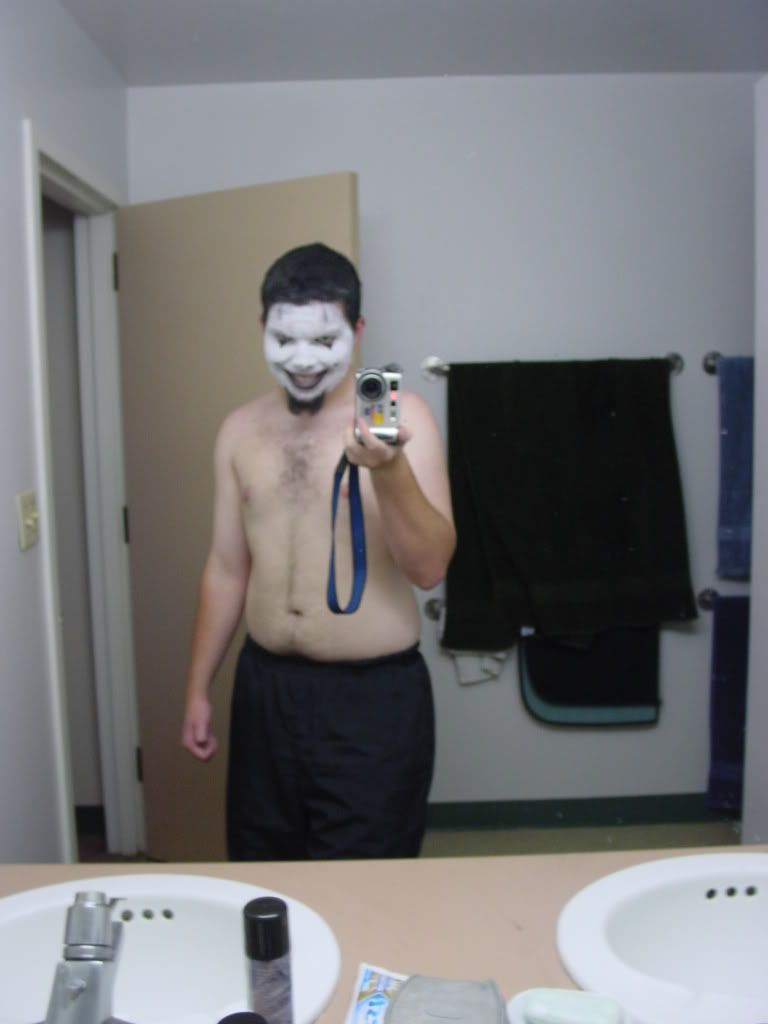
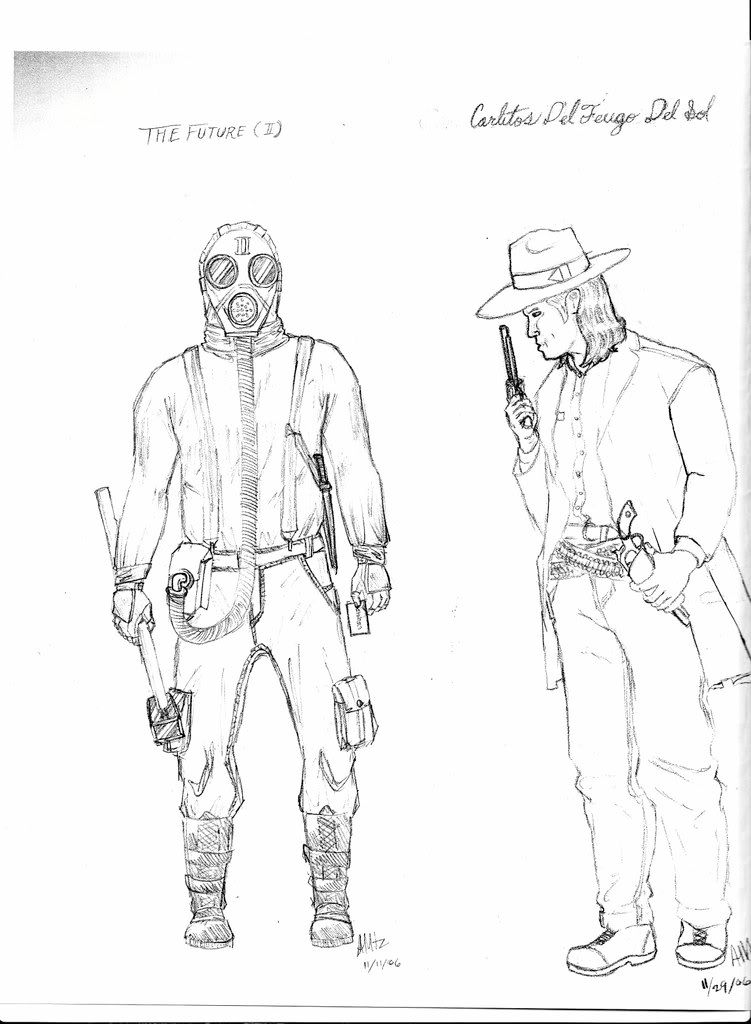
What's Black and White and Read All Over? This B&W BLOG!!! : I still believe this is the best way to do artistic photo-editing if you don't have Photoshop. (If you do have the program, however, the equivalent filter is "Torn Edges".) This also explains where I got my little profile picture and why I like it so much.
And that's all the required reading I have for you. Feel free to look at the rest of my MySpace profile. You can also always Google my name (it works best if you use quotation marks). I have a little artwork on website, I write news articles for Effectu, a tech news site, and I appear in a few other places. Plenty of material for those cold rainy nights.
Happy reading!
Subscribe to:
Posts (Atom)