
Namely, I wonder what it would have looked like had I access to a fully-fledged Photoshop program, as opposed to the absolutely primitive Adobe PhotoDeluxe 98 or whatever we had at the time.
One thing I know for sure would have changed would have been the font. The font that's used on my book's cover isn't what I wanted, or what I asked to be used. I guess when typesetting the thing, they weren't able to download the font I asked for, and so they stuck me with some not-exactly-Times-New-Roman font. Granted, it was italicized, but it was still much more plain than the font I had asked them to use (and I don't remember what that font was, so don't ask).
I also think that I might have messed with the picture a bit. If I were to remake it now, I think I would take the picture and make it starker yet more minimalist. It would be abstract, as opposed to showing you exactly what it was showing you; it would make you think.
'Course, I really have no idea if I this is because I have access to greater photo-editing software or because I've changed my own style in the...God, three to four years since I've worked to get the book published. I know I've matured, perhaps gotten a little darker and grittier (or, at other times, more wacky and light-hearted), so perhaps I'm trying to superimpose my current personality onto my older (er, younger) one.
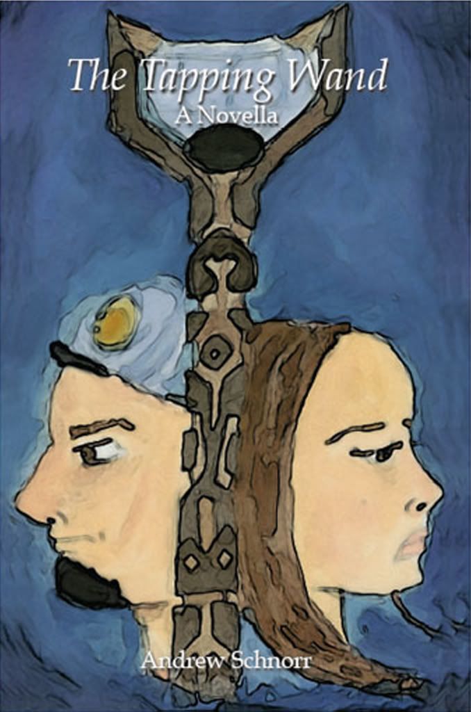
Anyway, to give you an idea of what I mean, I decided to give the cover a little push through Photoshop. Here's how the cover looks to the purchasing public:
 And here's what the cover would look like if I had published the book today:
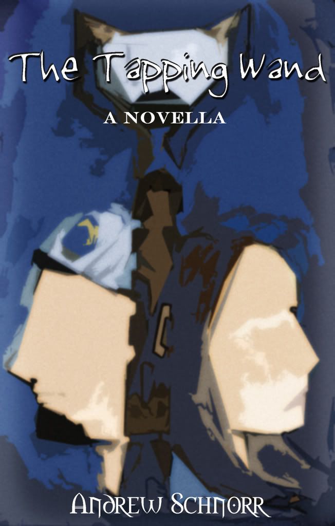 Is it better? Well, I can't really give an unbiased answer. All I know is that I would be more likely to pick up the latter cover at a bookstore...much more likely. Who knows, maybe in another 5 years, I'll be totally turned around on the subject, or maybe I'll think there should be yet another version.
But anyway, it was just a passing thought...
4 comments:
I like the second cover better as well. It seems much more intriguing.
I like the second cover better as well, but then I told you from the start that the first didn't allow the reader to have his own vision of the characters.
The second is more abscure and more attractive, and that is better for my liking. Yet my vote remains... I would have liked it best if it were the wand alone. It was enough and powerful and brought attention to itself and set up wonder?????.
I approve of the second cover...You can always release a second edition with the new and improved cover!
-Comrade Chavez
I like my cousin's original artwork, I vote for cover #1, if we're voting.
Post a Comment